
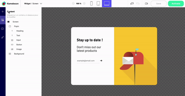
Add an element
In the Add element section, click on an element type to add it to your widget.

Several elements are at your disposal.
TYPOGRAPHY
- Heading
- Text
- Link
- Scrolling Text
MEDIA
- iFrame
- Image
- Video
- Html
- Slider
- Countdown
- Click-to-copy
- Progress bar (visually indicate how far the user is from achieving a goal)
- Step Progress bar (visually indicate with steps how far the user is from achieving a goal)
- QR Code
- Wheel of fortune
- Scratch Card
LAYOUT
- Block
- Close cross
- Shape
- Tooltip
FORM
- Button
- Input
- Date
- Time
- Toggle
- Checkbox
- Radio button
- Select
- Text area
- Range input (allow the visitor to select a value using a sliding control that is fully editable)
- Hidden input (store meta data submitted with the form, but not displayed to the user)
- Error message
The added element appears in the list of the Content section. You can then edit its characteristics.
Note: The layer stack reflects the position of the elements in the foreground or background.
Design an element
In the Content section, design the elements of your widget.

Select an element
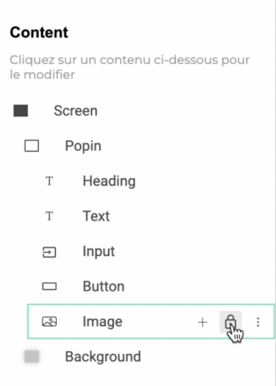
Click on an element in the center preview area to select it, or click on its name in the hierarchy panel on the left (it will highlight the linked element).

Hover over an element
On hover on an element in the left panel, secondary actions buttons are displayed. Click on the + icon to add an element below the selected one. Click on the 3 dots to edit, rename, duplicate, hide or delete the element.

Note: If an event is associated to one of your elements, you can’t delete this element. You will need to delete the event first.
Duplicate
You can either duplicate an element within the same screen, or duplicate an element from one screen to another within the widget.
If your widget contains several screens, you can choose to duplicate an element in another screen.

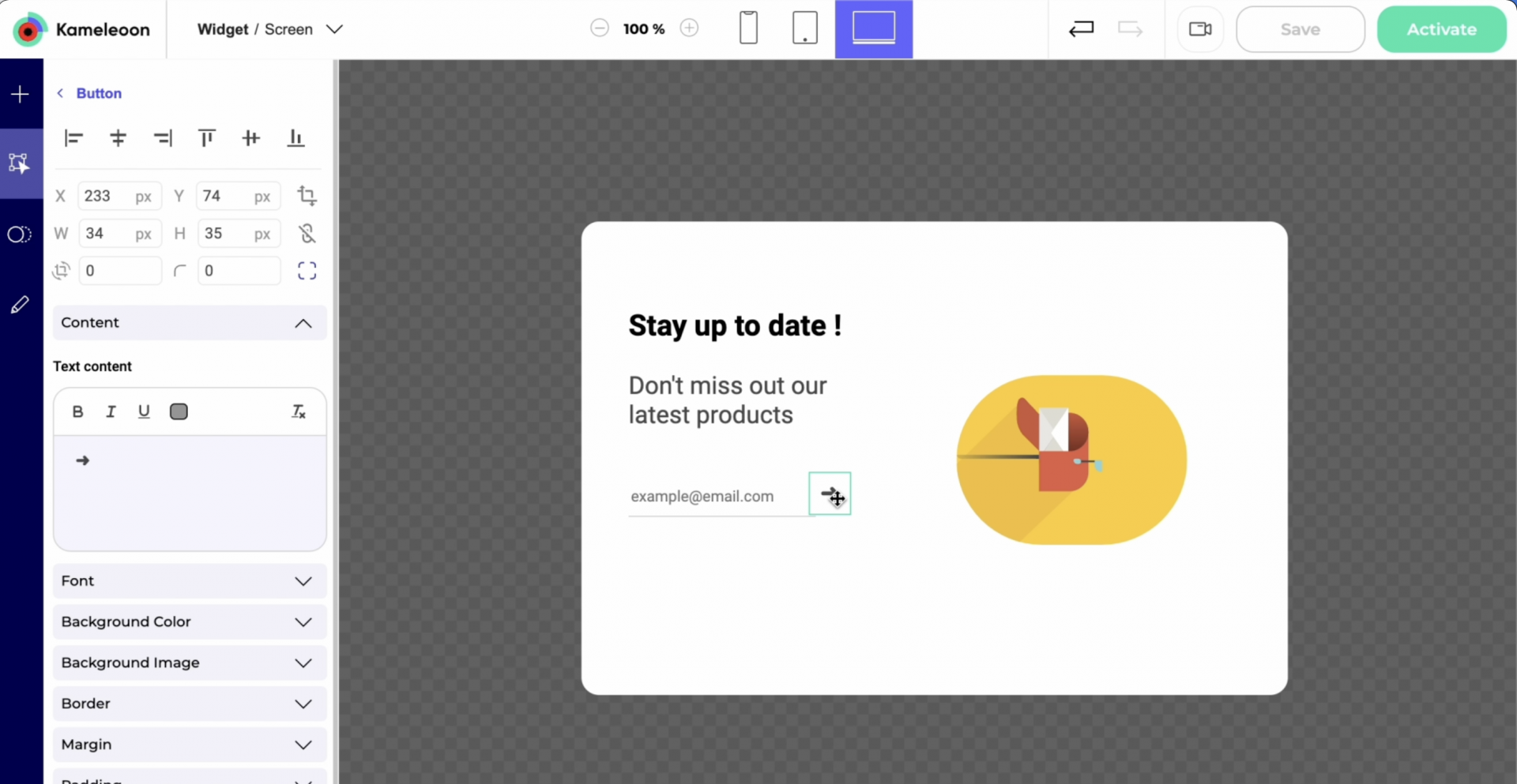
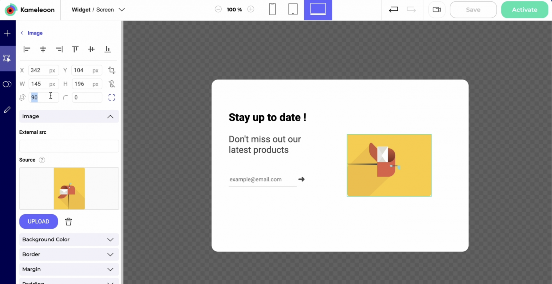
Click on an element
On click on an element in, you access its settings. Depending on its type, some characteristics can be edited.

You can use AI to edit or generate your texts.


To be able to add a link, you need to highlight a word, a group of words or the whole part of the text.

Note: To modify the URL associated with a text, you can also create a click event, and then associate a URL action with it.
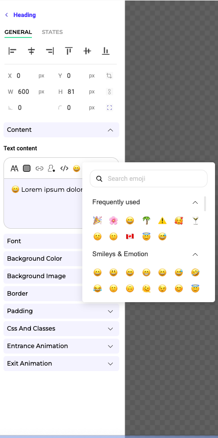
You can also add emojis to your headings, texts and links.
Upload your own font
You can add custom fonts to personalize your widget’s text and match your brand identity more precisely.
Click on the T icon in the text editor, then click on + Add a font above the Font family dropdown

In the font import settings, choose your Font Source:
- From your website: Select this option if the font is already hosted on the same website as the widget.
- Link to a font file: Provide the direct URL to the font file (e.g. .woff, .woff2, or .ttf).
- Embed code: Insert the CSS code to import the font using
@importor@font-face(from services like Google Fonts or Adobe Fonts).

Then specify the Font Family name and click Preview & Add to instantly see how the font will look with your text.

Optionally adjust the preview text and toggle italic display. You can select one or several font weights before confirming with Add.
Once saved, your font will appear in the Font family dropdown and can be applied to any text element with real-time preview.

Note: If you don’t specify a source, the font may not render in the Widget Studio and will only appear correctly once added to a campaign and simulated.
Use the colors of your corporate identity
With our eyedropper in the color picker panel, you can pick any color from the screen and use it to design an element.

Insert dynamic texts & links
You can insert automatically generated text or link parameters based on the value of a form input / API / custom data.

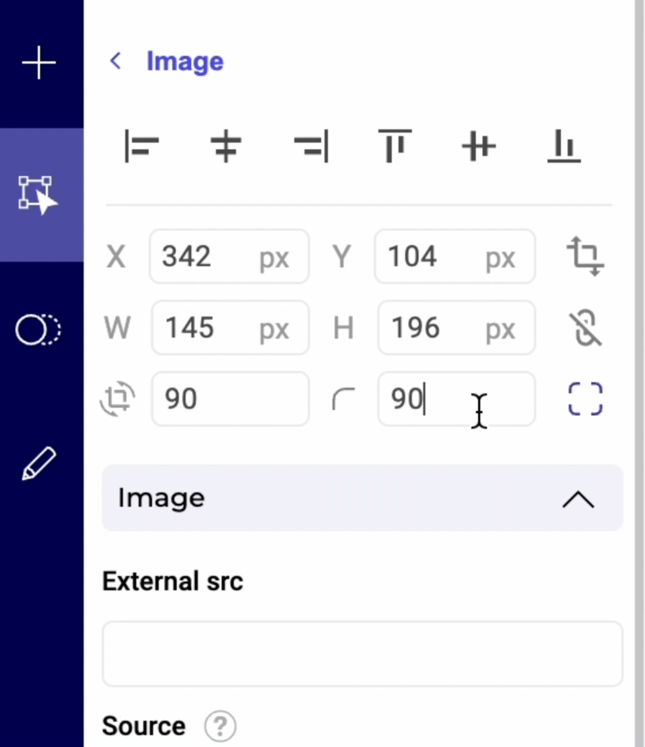
Resize an element
You can easily change the size of your elements in the preview window (on the right). Position your cursor on one of the edges of the element and drag to edit its dimensions.
It is also possible to modify these dimensions in the left panel.
Smart guides
Smart guides will allow you to easily and accurately align and position elements both vertically and horizontally while editing your widget.
Distances between elements are also displayed when you move an element, to help you position and align it.

Constrain proportions
Once your element is resized, you can lock its dimensions to prevent mistakes when you continue editing the widget.
To do this, in the left panel when the item is selected, simply click on the padlock that appears at the hover over the item.
Edit the states of an element
When one of the elements that make up your widget is selected, two tabs appear at the top of the editing menu: General and States.
Select the States tab to find additional properties that allow you to fully edit the style of each state of this element (Hover, Active, Disabled…).

For example, you can personalize the hover appearance of a heading element depending on its state.

All these parameters are editable to allow you to create widgets that perfectly match your graphic charter and specific needs. The states available for edition depend on the selected element, and the editable properties for each state are specific to each element.
When the States tab is selected, if you click on the General tab, the preview of your widget will automatically switch to its default state. Depending on the form element you are editing, you can choose the default state of the element on the General tab. Example: for a toggle, you can set the default display to either ON or OFF.
Move an element
If you want to move an element, you just have to drag-and-drop it in the preview.
Rotate an element
If you want to rotate an element, select it and enter the desired rotation angle in the rotation parameter located in the left panel.
Edit an image in the Image Editor
To open the Image Editor, navigate to the image you wish to edit and select the Open in Image Editor button. This will launch the Image Editor interface where you can begin making changes.

4 tabs are available in this editor:
- Frame
- Draw
- Shapes
- Filters
On the top right of the Image Editor, you can zoom in and out, undo your changes, reapply them or change image to be edited.
Frame
Here you can resize, crop or flip your image.

Resize
To resize your image, click on the Resize tool. Enter the desired dimensions or use the slider to adjust the size proportionally.
Crop
If you need to trim the edges of your image, select the Crop feature. You can choose a preset dimension or freely select the crop area.
Flip
You can flip your image horizontally or vertically using the Flip tool, which is useful for correcting the image orientation or creating mirrored effects.
Draw
Use the Draw tool to freehand draw on your image. Select the brush size and color to personalize your drawing.

Shapes
Insert shapes like circles, squares, or arrows with the Shapes tool. You can adjust the size, color, and position of the shapes as needed.

Filters
Enhance your image with filters by selecting the Filters option. Choose from a variety of filters to change the mood or add artistic flair to your image.

You can also adjust the brightness, noise or threshold of your image.

Don’t forget to save your changes!
Edit the HTML of a text element
You can select any text element in your widget and directly edit it in HTML.

Animate an element
You can add an animation directly on one of the elements of your widget.
When an element is selected, two parameters Entrance animation and Exit animation can be activated in the left panel.
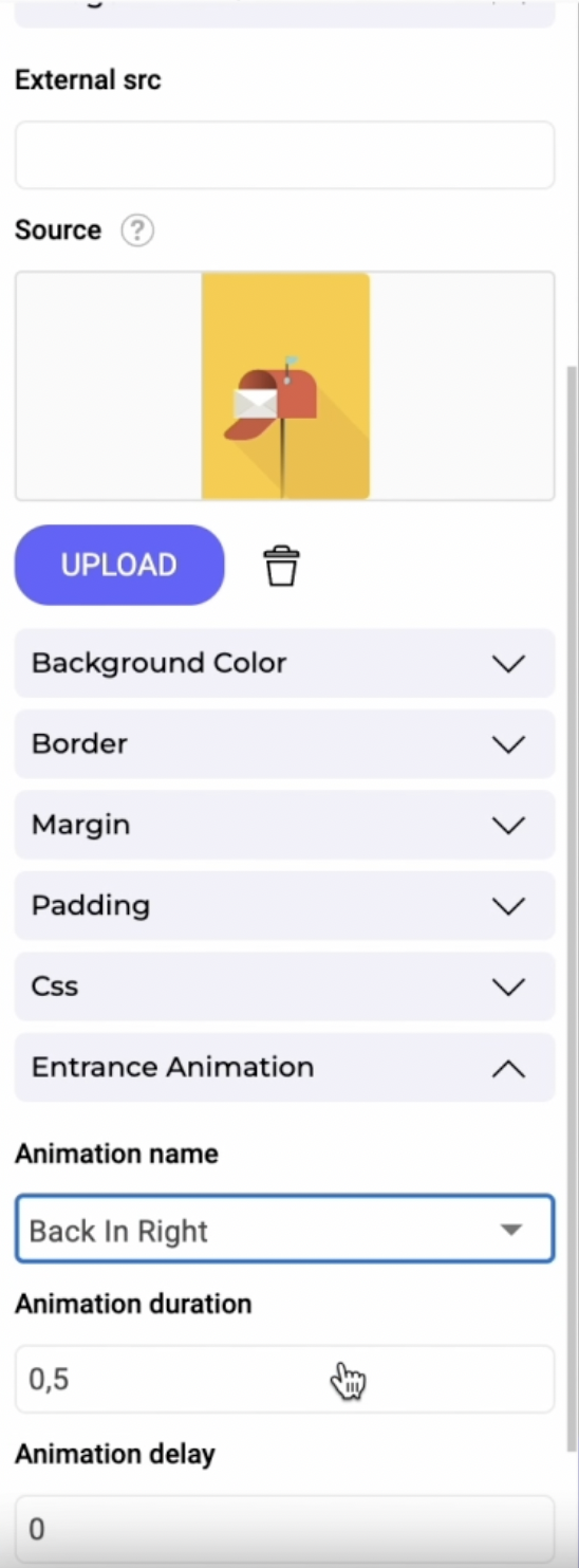
You just have to choose an animation effect, a duration and optionally a delay.

Click on the Previsualize button to previsualize your animation.
Insert a custom data into an element
You can use custom data in your widget to create better personalization opportunities. With this option, you can insert a dynamic value in any text field.
Select a text element and click on the custom data option in the left panel.

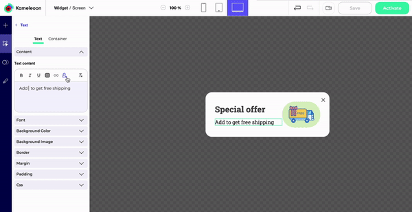
It will add the value of a custom data at the position of your choice in the text.
Select a data source (a custom data you already created).
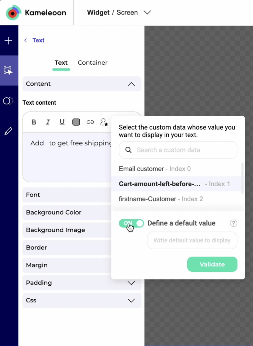
You can attribute a default value to your custom data. This default value will be displayed if the value of your custom data is undefined or null.
Click on Validate.
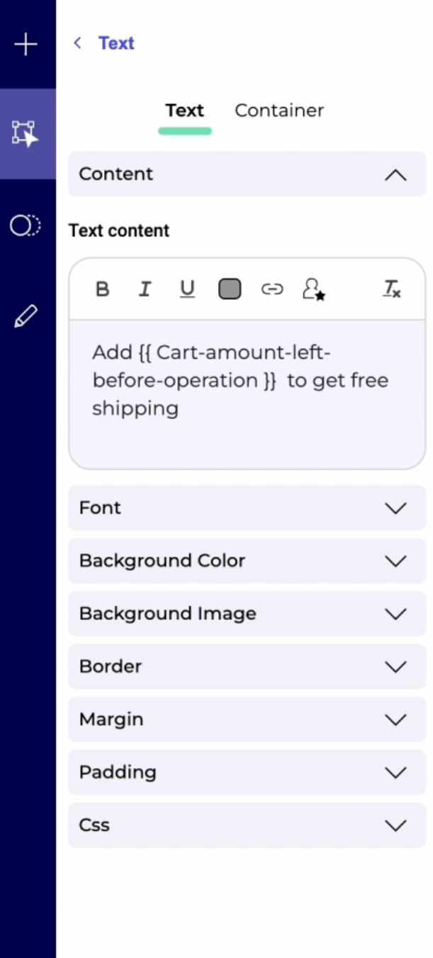
Then simulate how the custom data would be displayed in production.
