Edit your widgets
Add an element
In the Add element section, click an element type to add it to your widget.
Several elements are available.
Typography
- Heading
- Text
- Link
Survey
- Button
- Short Answer
- Long Answer
- Multiple Choice
- NPS
- Scale
- Hidden input
Media
- iFrame
- Image
- Video
- HTML
- Slider
- Countdown
- Click-to-copy
- Progress bar
- Step Progress bar
- QR Code
- Wheel of fortune
Layout
- Block
- Close button
- Shape
- Tooltip
Form
- Input
- Date
- Time
- Toggle
- Checkbox
- Radio button
- Select
- Text area
- Range input
- Error message
The layer stack reflects the position of the elements in the foreground or background.
Design an element
You can design your widget's elements in the Content section.
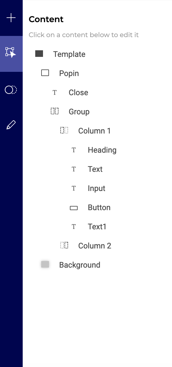
Select an element
Click an element to select it, or click its name in the hierarchy panel on the left.
Hover over an element
Hovering over an element in the left panel will display secondary actions. Click the + icon to add an element below the selected element. Click the three-dots menu to edit, rename, duplicate, hide, or delete the element.
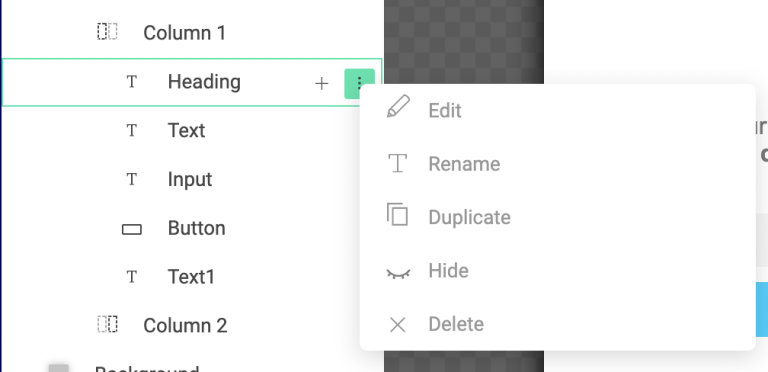
If an event is associated with one of your elements, you can't delete the element. You must delete the event first.
Duplicate
You can duplicate an element on the same screen, or duplicate an element from one screen to another.
Click on an element
Click an element to access its settings.
You can use AI to edit or generate your text.
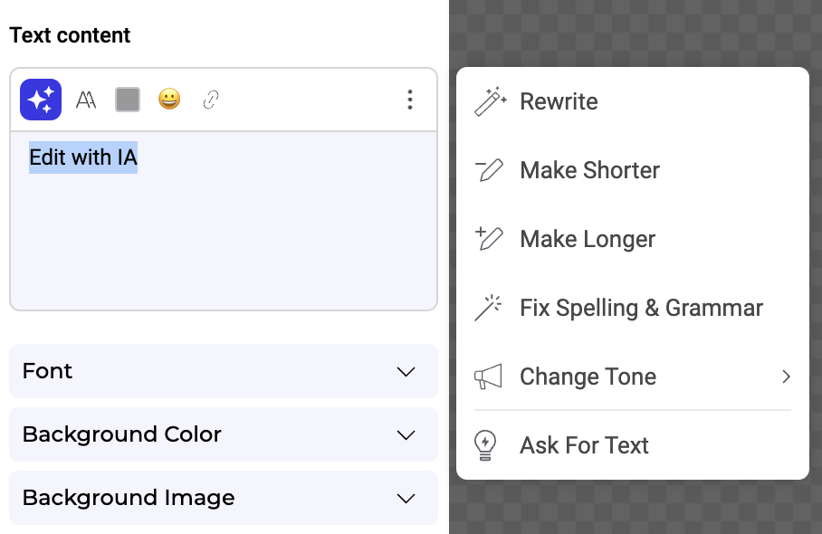
To add a link, highlight a word, group of words, or a whole block of text.
To modify the URL associated with text, you can create a click event and associate a URL action with it.
You can also add emojis to your headings, text, and links.
Upload your own font
You can add your own font to your widget.
- Click the T icon in the text editor, then click + Add a font.
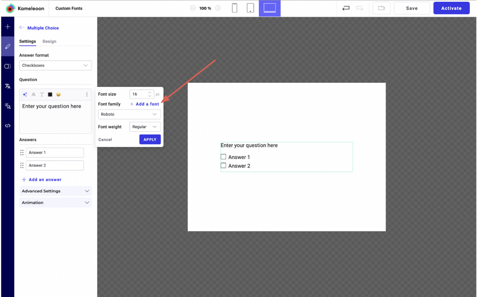
- In the font import settings, choose your Font Source:
- From your website: Select this option if the font is already hosted on the same website as the widget.
- Link to a font file: Provide the direct URL to the font file (for example
.woff,.woff2, or.tiff). - Embed code: Insert the CSS code to import the font using
@importor@font-face(from services like Google Fonts or Adobe Fonts). When pasting Google Fonts, only copy the code from@importto</style>.
- Specify the Font Family.
- Click Preview & Add to instantly see how the font will look with your text.
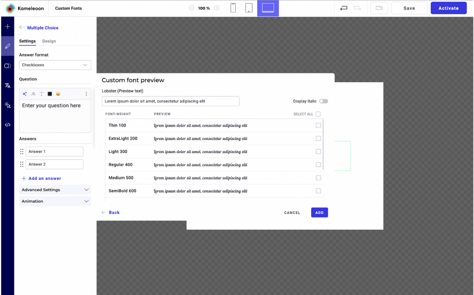
You can also adjust the preview text and toggle italic display. You can select one or several font weights. Click Add to confirm.
Once saved, your font will appear in the Font family dropdown. You can apply the font to any text element and preview it in real time.
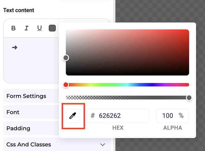
Use custom colors
With the eyedropper in the color picker panel, you can pick any color on the screen and use it in an element.
Insert dynamic texts & links
You can insert generated text or link parameters based on the value of a form input/API/custom data.
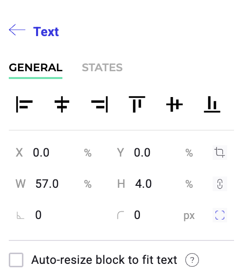
Resize an element
You can resize your elements in the preview window (on the right). Position your cursor on an element's edge, then click and drag to edit its dimensions.
You can also modify these dimensions in the left panel.
Auto-resize text and heading
This option automatically adjusts the element's size, so it expands or shrinks to fit the text content.
Smart guides
Smart guides help you align and position elements both vertically and horizontally while editing your widget.
Constrain proportions
Once your element is resized, you can lock its dimensions.
To constrain an element's proportions:
- Select an element in the left panel.
- Hover over the element and click the padlock.
Edit an element's states
When you select an element, two tabs appear at the top of the editing menu: General and States.
Select the States tab to find additional properties that let you edit the element's states (Hover, Active, Disable).
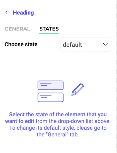
For example, you can personalize a heading element's hover appearance depending on its state.
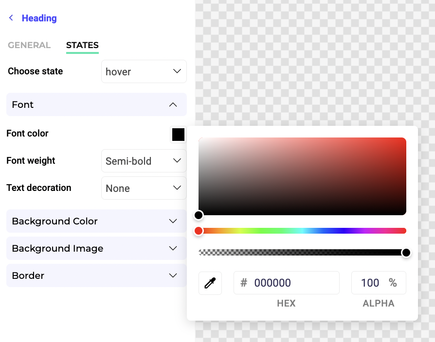
When you select the States tab, your widget's preview will switch to its default state if you click the General tab. You can choose the element's default state in the General tab.
Move an element
Drag and drop an element in the preview to move it.
Rotate an element
If you want to rotate an element, select it, and enter the desired rotation angle in the rotation parameter located in the left panel.
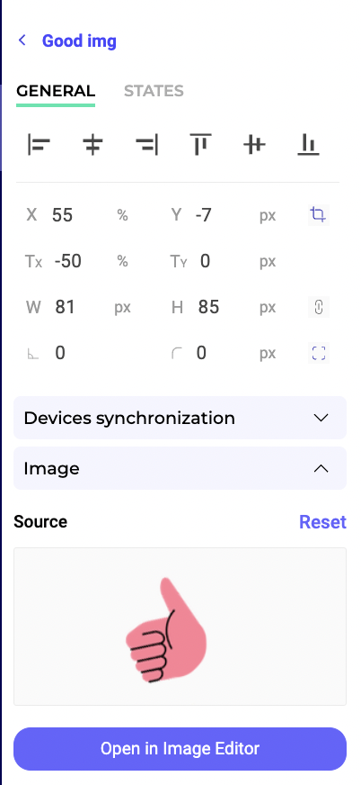
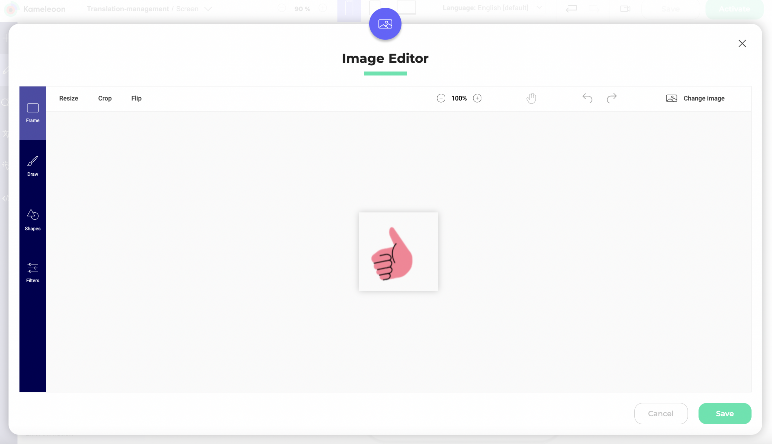
Edit an image in the Image Editor
To edit an image in the Image Editor:
- Navigate to the image you want to edit.
- Select Open in Image Editor. The Image Editor will open.
- Apply your desired edits.
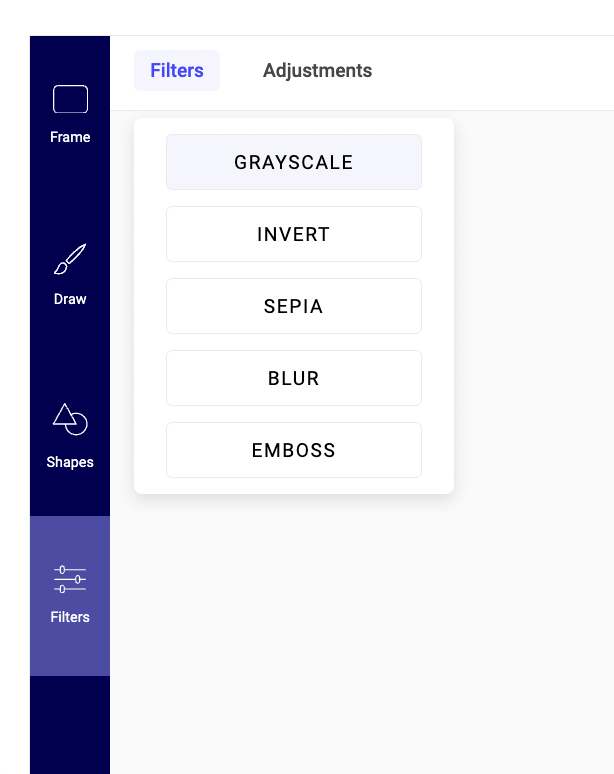
Four tabs are available in this editor:
- Frame
- Draw
- Shapes
- Filters
In the top right of the Image Editor, you can zoom in and out, undo your changes, reapply them, or change the image you're editing.
Frame
Here, you can resize, crop, or flip your image.
Resize
To resize your image:
- Click the Resize tool.
- Enter the desired dimensions or use the slider to adjust the image's size.
Crop
If you need to trim the edges of your image:
- Click the Crop tool.
- Choose a preset dimension or select the crop area.
Flip
You can flip your image horizontally or vertically using the Flip tool.
Draw
Use the Draw tool to draw on your image. Select the brush size and color to customize your drawing.
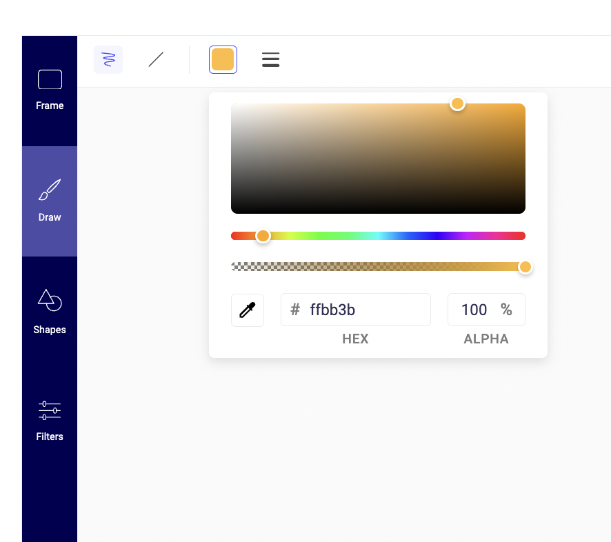
Shapes
Insert shapes, like circles, squares, or arrows, with the Shapes tool. You can adjust the shape's size, color, and position.
Filters
Enhance your image with filters by selecting the Filters option. You can adjust your image's brightness, noise, and threshold.
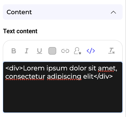
Edit the HTML of a text element
You can select any text element in your widget and edit it in HTML.
Animate an element
You can animate a widget's element.
When an element is selected, you can activate two parameters (Entrance animation and Exit animation).
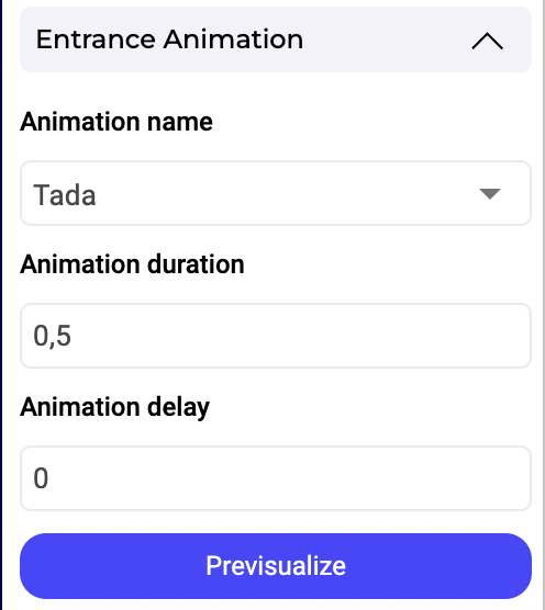
You must choose an animation effect, duration, and a delay (optional). Click Pre-visualize to preview your animation.
Insert a custom data into an element
You can use custom data in your widget to create better personalization opportunities. With this option, you can insert a dynamic value in any text field.
To insert a dynamic value in a text field:
- Select a text element and click custom data in the left panel.
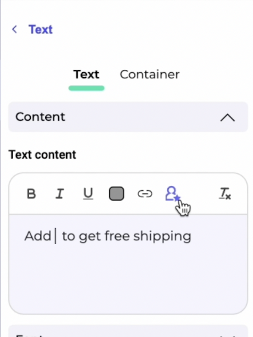
- Select a data source (a custom data you already created). You can attribute a default value to your custom data. This default value will be displayed if your custom data's value is undefined or null.
- Click Validate.
You can then simulate how the custom data will display in production.