Create a theme
Creating a theme lets you define a standardized design system for your team. You can set specific colors, upload brand fonts, and pre-build components directly in the Theme Builder.
Create a new theme
- Go to Studio > Themes in the left sidebar.
- Click Add a theme.
- Enter a name for the theme and select the Project(s) it will affect.
- (Optional) Add a description and tags.
- Click Next to open the Theme Builder.
Define colors
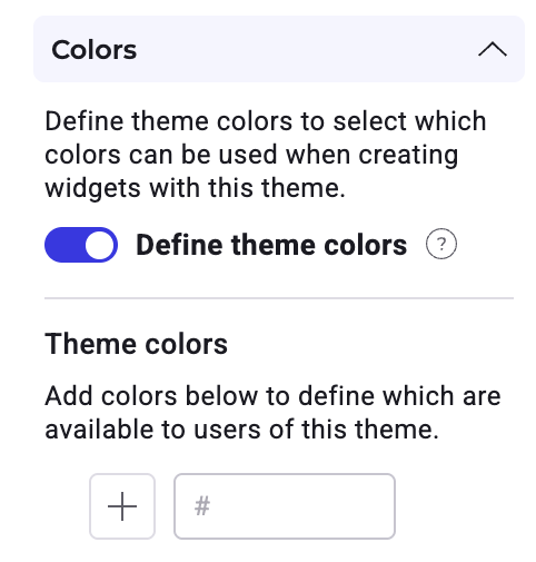
Use the Colors section to define the palette available to users.
To restrict users to specific brand colors, toggle Define theme colors to ON.
- Add a color: Enter a hex code or click the + icon. You can select a color from the gradient, adjust opacity, or use the eyedropper tool to sample from your screen.
- Manage colors: Drag and drop colors to reorder them. Click the trash icon to remove a color.
If you add a component to the theme while Define theme colors is ON, that component's default colors are automatically added to your theme colors list.
Colors added here are available under Theme Colors in the Widget Studio.
Modifying locked colors
If a color is currently used by a component in your theme, you cannot delete it. However, you can edit the color. When you modify a color, the change automatically applies to every component in the theme that uses that color.
Add fonts
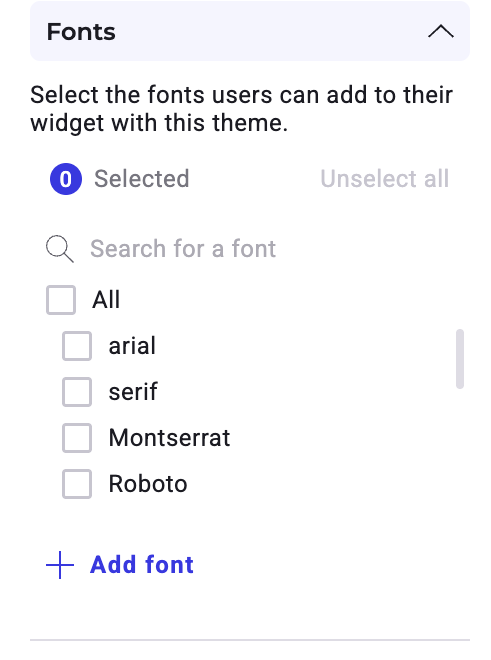
In the Fonts section, determine which distinct typography users can access. Check a font from the list to include it in your theme. Use the search bar to search for a specific font.
You must select at least one font to add components to your theme. If you remove a font that is currently in use, the system defaults to the first font in your list.
To add a font:
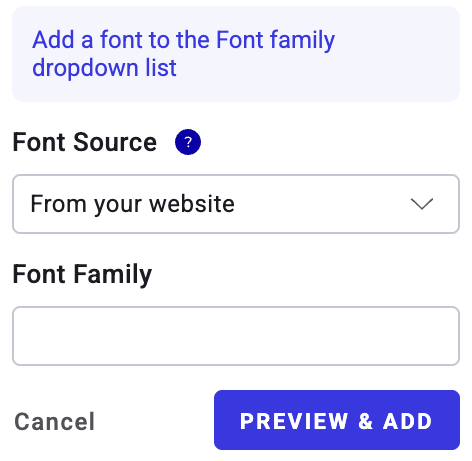
- Click + Add font.
- Select your font source:
- From your website: Enter the Font Family name.
- Link to a font file: Enter the Font Family name and the URL to the file.
- Embed code: Enter the Font Family name and the import code.
- Click Preview & add.
- Select the font weights you want to include.
- Click Add.
Add and manage components
The Components section allows you to pre-configure elements (like buttons, images, or forms) for your team and define which components are allowed in the theme. You can add the same component type multiple times to create variations—for example, a distinct "Submit" button and a "Cancel" button.
Add a component
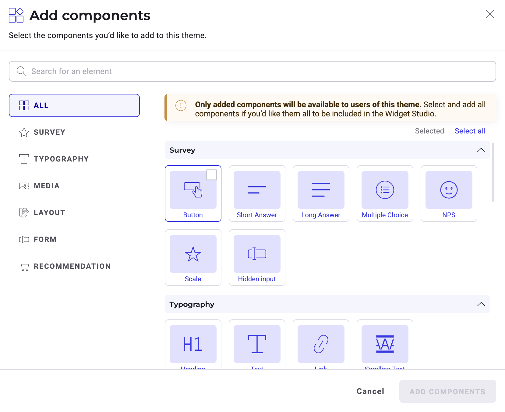
- Click + Add next to Components.
- Search for a component or browse categories in the left sidebar.
- Select the components you want to include.
- Click Add components.
Edit and lock components
Once a component is added to your list, click the secondary actions (three dots) menu to manage it:
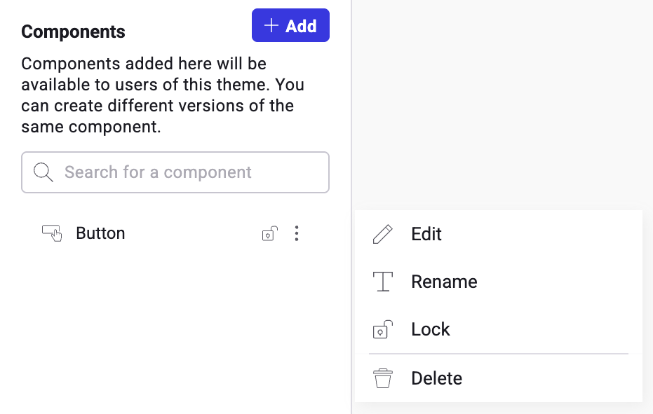
- Rename: Give the component a descriptive name (for example, "Primary CTA").
- Edit: Open the component editor to adjust styles using Widget Studio tools.
- Lock: Restrict editing permissions for this component. Alternatively, click the lock icon next to the Secondary actions menu to lock a component.
- When locked: Users can only modify the content (text/images), position, and size. They cannot design elements like colors or borders.
- When unlocked: Users have full control to change the design.
Activate your theme
When you finish configuring your theme, click Activate in the top right corner. The theme is now available for use in your experiments and personalizations.
To deactivate a theme later, click the status dropdown (Active) and select Deactivate, or use the Themes dashboard.