Edit a variation
The following guide explains how to select elements, modify properties, and add new components. It also covers customizing styles for different devices and setting interaction states.
To learn how to create and manage variations, refer to the article on adding and managing variations.
Select an element
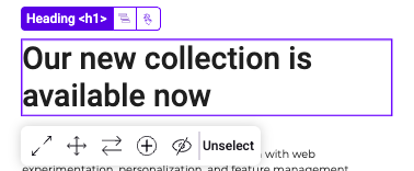
The Graphic Editor simplifies element selection. When you hover over parts of a webpage in the editor, Kameleoon highlights each element. Double-click an element to select it.
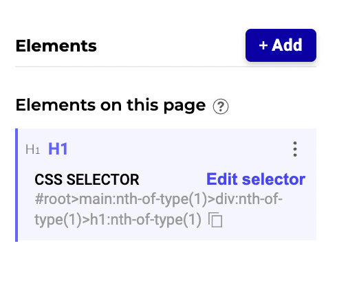
When you select an element, options appear above the selected element, allowing you to select another relative or edit the element's CSS selector.
Element details
Upon selection, the element's details, such as its tag, are displayed. Element details help you understand the type of content you are interacting with.
Highlight
You can access the Highlight in preview options by clicking the cogwheel icon. These switches allow you to highlight elements directly in the preview with different colors.
- Added Elements: Highlighted with one color to show newly added elements.
- Changed Elements: Highlighted with another color to identify elements you've modified.
Visual feedback from highlighting makes it easy to spot changes or additions.
Search, sorting, and filtering
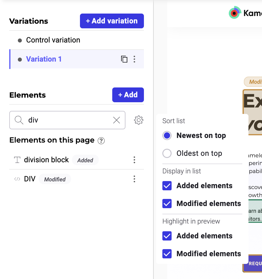
The Element panel provides useful tools for searching, sorting, and filtering.
- The search bar allows you to find elements by name or tag. For example, if you type "div", the search will return all
<div>elements, and any elements with "div" in their name. - The sorting options help you navigate through long lists of elements.
- Newest on top: Sorts elements by their creation or first modification date, with the most recently created or modified elements appearing at the top. This sorting method respects the original creation or first modification date: regardless of future edits, the oldest elements still appear first.
- Oldest on top: Sorts elements by their creation or first modification date, with the oldest elements appearing on top. This method respects original creation or modification dates, as per Newest on top.
- The Element panel allows you to Filter items based on specific criteria, allowing you to narrow the list of elements to those relevant to your current task.
Select another relative
The Select another relative feature helps you navigate the hierarchical structure of webpage elements. Use this feature when you need to select a related element that you cannot access directly.
For example, if you've selected a heading within a banner and want to select the entire banner, click Select another relative and navigate to the parent element.
Edit CSS selectors
Use CSS selectors to specify which elements your changes affect. You can refine existing selectors, generate new ones with AI, or manually input custom code.
To target an element, you can use standard selector types (such as hierarchy, tag, class, or content), or use AI-generated selectors if you are unfamiliar with CSS syntax.
Manual input is also available for precise targeting, which is useful when an element is deeply nested or shares multiple classes with other elements.
Available selector types
The following table describes the available selector types, when to use them, and their potential risks:
| Selector type | Description | Recommended use | Risk |
|---|---|---|---|
| AI Generation/Automatic | Automatically generates a selector by combining multiple attributes into a fingerprint. | Use as a starting point or if you are unfamiliar with CSS. | Complexity: Selectors can be long and difficult to debug if they fail. |
| Hierarchy | Identifies an element based on its exact position in the DOM (for example, body > div#main > section > ul > li:first-child). | Use when the element lacks a unique ID or class and its position is static. | Fragility: Small layout or container changes often break the selector. |
| Class | Targets elements by their CSS class name (for example, .btn-primary or .promo-banner). | Use to target groups of elements with the same design or when a unique class exists. | Over-targeting: Changes might unintentionally affect other elements that share the class. |
| Attribute | Targets specific HTML attributes (for example, [data-testid="submit-button"]). | Use for precise targeting, specifically when testing data attributes are available. | Dynamic values: Selectors break if attributes contain dynamic values (like session IDs) that change. |
| Content | Selects elements based on visible text content (for example, :contains("Sign Up")). | Use when the code structure changes frequently, but the text remains constant. | Localization: Text updates or language translations cause the selector to fail. |
| Tag | Targets elements by HTML tag name only (for example, <h1>, <a>, or <div>). | Use for global styling or in combination with other selectors. | Broad scope: Alone, this targets many elements and can break page layouts. |
| Manual | Applies custom CSS or JS selectors that you write. | Use when you need complex logic or specific targeting not handled by other types. | User error: Requires CSS knowledge; typos or site updates can break the experiment. |
Change an existing element
Once an element is selected, you have multiple modification tools at your disposal.
The tools are accessible in the element toolbar and the right-hand panel.
Element toolbar
The element toolbar appears right above the selected element, providing quick access to several editing options:
- Move: Change the element's position.
- Resize: Adjust the element's dimensions.
- Duplicate: Create a copy of the selected element.
- Delete: Remove the element from the page.
- Edit content: Modify the text or image within the element.
Right-hand panel
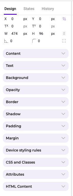
The right panel in the editor provides in-depth options for customization. Here you can access more detailed settings for the selected element, including:
- Content: Edit the text, image, or other content within the element.
- Text: Adjust text alignment, line height, and make text capitalized, uppercase, or lowercase.
- Background: Change the element's background color or image.
- Opacity: Change the element's opacity.
- Border: Add borders or modify their color, style, and width.
- Shadow: Apply shadow effects to give the element depth.
- Padding and margin: Fine-tune the spacing around and within the element.
- Device styling rules: Customize how the element appears on different devices (desktop, tablet, mobile).
- CSS and classes: Add custom CSS classes or styles for more advanced customization.
- Attributes: Edit HTML attributes of the element.
- HTML content: Directly modify HTML content if needed.
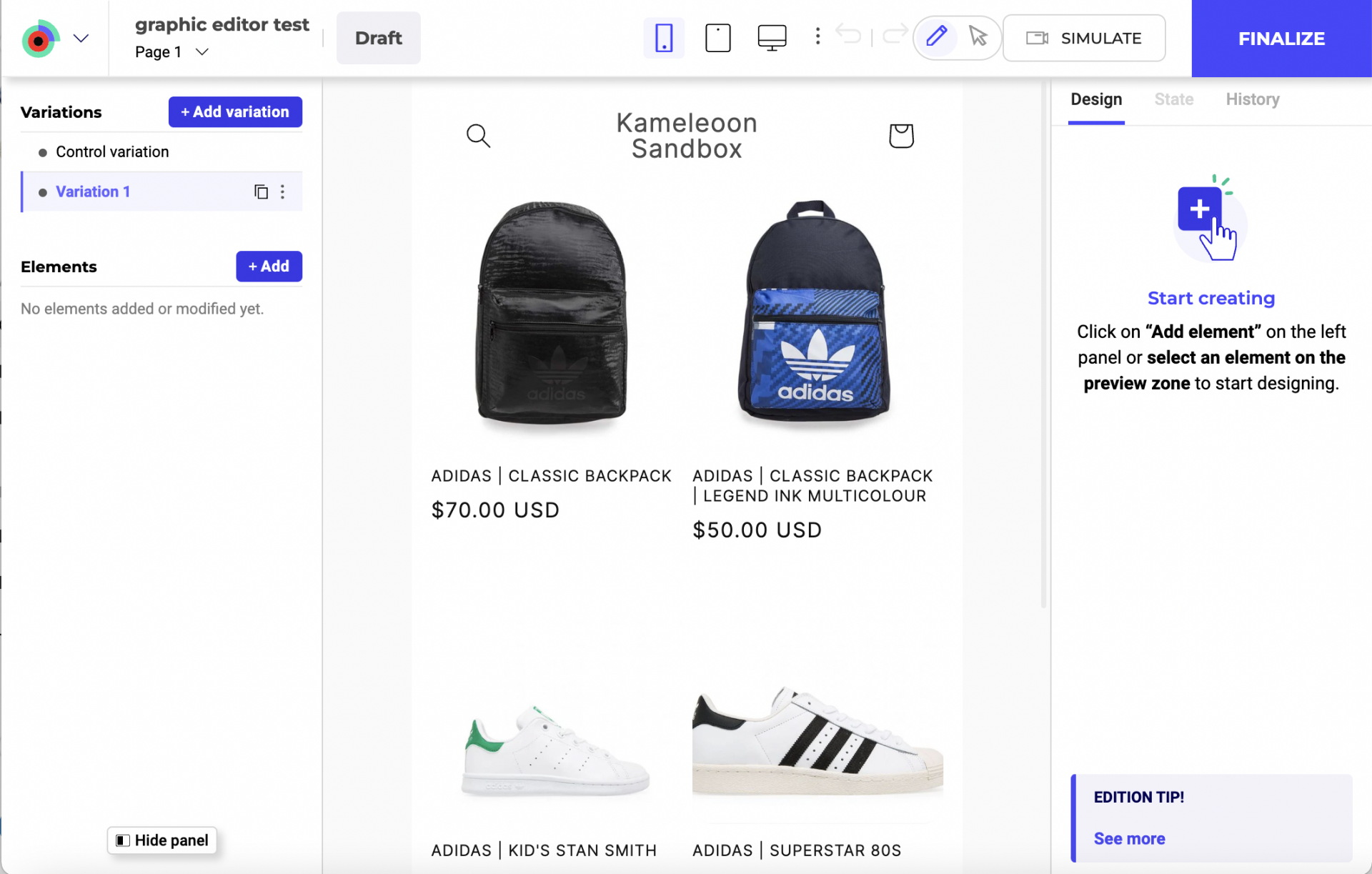
Add a new element
Adding a new element in Kameleoon's Graphic Editor is straightforward and allows for extensive customization to fit your design needs.
Open the Elements panel
In the left sidebar, click + Add to open the elements panel.
Choose an element to add
You have several options such as Text, Heading, Image, Widgets, and HTML. Click on the type of element you want to add.
Select position of the element
You can choose the new element's position relative to other elements. Options include Inside the page or Above the page, and can be set to Relative or Absolute.
Specify the exact position relative to a selected reference element (for example, before, replace, or after).
Manual positioning
For precise positioning, enable the manual position option and specify the element's top, right, left, and bottom values in pixels.
Define the reference element
You can define the reference element's CSS selector to position the new element accurately.
Click the reference element in the preview zone or manually input the CSS selector.
Adjust display settings
Choose the display settings for different devices (desktop, tablet, mobile). You can modify the element's visibility in the left panel later if needed.
Use the color picker
Eye dropper
Use the eyedropper tool to select any color on your site's page and apply it to another element.
Contrast ratio
In the same color picker, you can check the selected color's contrast ration with white.
Colors preset with the ones used on your site
In the lower part of the color picker, you will find the colors you use most on your site. Click one to apply the color to an element.
Advanced actions
States
The states feature allows you to customize the appearance and behavior of elements based on their interaction states. To edit an element's state:
- Click the element you want to edit. The element toolbar and right panel open.
- Click the State tab in the right panel.
- Select the state you want to assign to the selected element: Hovered, Active, Focus, or Disabled.
Once you select a state, various customization options appear. You can change font, text, line, style, color, alignment, line height, border, shadow, padding, and margin for the selected state.
For example, if you select the Disabled state, you can change the text color to indicate that an element is inactive.
Device styling rules
In the right-hand sidebar, you can define styling rules for an element that may differ from one device to another.
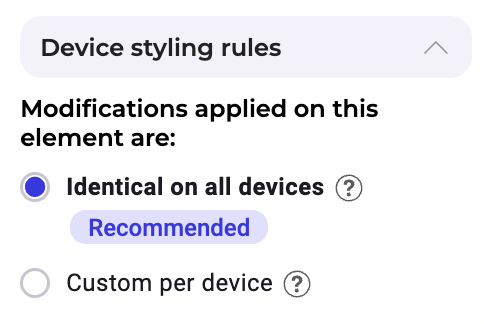
By default, changes made on one device mirror across all other devices, except for size, rotation, padding, and position settings. Kameleoon recommends this synchronization method for A/B testing, as it yields more reliable results.
In some cases, you can select the Customized per device mode. Changes made on one device remain exclusively on that device. Kameleoon does not recommend the customized per device setting for A/B testing, as it may lead to less reliable results.
Multi-device feature
You can use the multi-device feature in the Kameleoon Graphic Editor to preview how your design appears on different devices.
To view your website's appearance on different devices, click the phone, tablet, or desktop icon at the top of the editor.
You can toggle between devices to test responsiveness and make necessary adjustments to your design elements for optimal display across devices.
To test your design on different smartphone resolutions, click the three-dots menu near the device selection toolbar. A submenu lists various smartphone models along with their screen resolutions. Click a specific model to change the preview area resolution. You can then review and adjust the design to ensure it functions on the specific device.
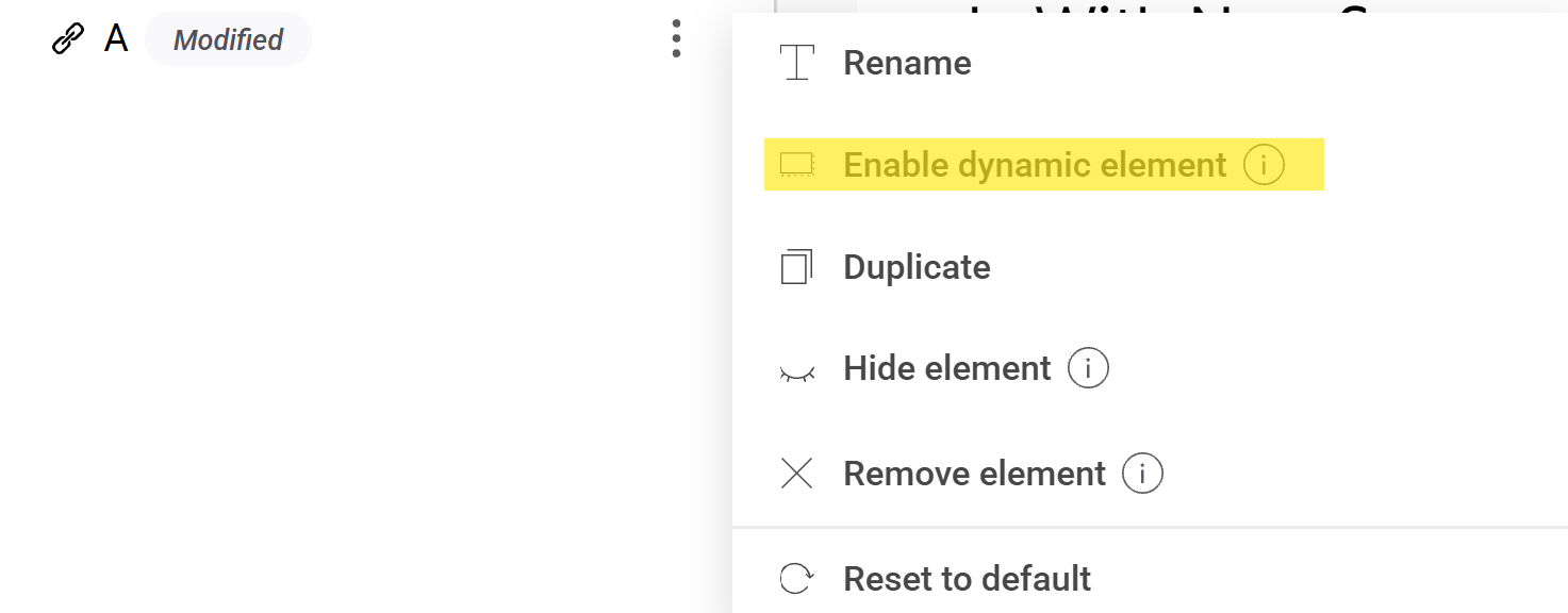
Enable dynamic elements
If you enabled support for dynamic websites in your project settings and set the scope to Selected elements in the Graphic editor, you can include specific elements by clicking the three-dots menu next to a modified element and selecting Enable dynamic elements.
Edit hidden elements
To edit a click-triggered menu or hover-over text on a card:
- Enter navigation mode by clicking the icon in the header.
- Hover or click on the trigger element
- Hold CMD (Mac) or CTRL (PC) on your keyboard.
- Click the element.
You'll be redirected to design mode.