Add a survey element to your widget
In the Widget Studio, you can build fully functional surveys (for example, NPS, CSAT, satisfaction forms, product feedback) using a set of dedicated Survey elements. Each element comes with its own customization.
The Survey element suite allows you to:
- Build structured, branded NPS and CSAT widgets.
- Collect qualitative and quantitative feedback.
- Apply detailed validation rules.
- Export or route responses flexibly.
Survey data can be collected either in Kameleoon (exportable in .csv format), or sent to an external service via an HTTP request.
Survey elements
Survey elements are listed under the Survey section in the Add element panel.
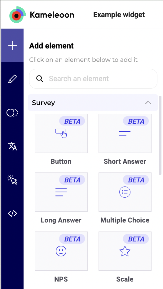
- Button: Required to trigger the survey submission.
- Short answer: Collects short textual input from users.
- Long answer: Ideal for longer, open-ended feedback.
- Multiple choice: Includes support for checkboxes, single or multiple selection, optional "Other" field, and answer randomization.
- NPS: Gathers Net Promoter Score data with optional follow-up questions.
- Scale: Renders a scale using numbers or emojis.
Each element is configurable using dedicated settings and styling options in the Widget Studio.
Settings
Button
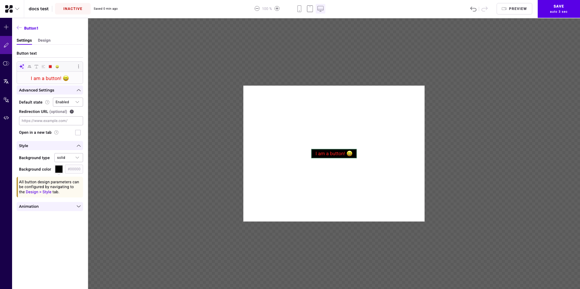
General settings
- Button text:
- Enter your button's text in the text field.
- Use the buttons above the text field to:
- Edit your text with AI.
- Access styling options.
- Edit your text's font.
- Change your text's alignment.
- Edit your text's color.
- Add an emoji.
- Click the three-dots menu to:
- Remove formatting.
- Expand the text editor.
- Style: Change the button's background type and color.
- Animation: Select an entrance or exit animation for your button.
Advanced Settings
In Advanced Settings, you can define:
- Default state: Whether the button will appear by default.
If you select Disabled and previously activated Make required on any survey, the button will automatically become enabled once users respond to all required elements on the same screen.
- Redirection URL: The URL that users who click the button will be redirected to.
- Open in new tab: Toggle whether the redirection URL will open in a new tab.
Design
There are two tabs in the Design menu: General and Style.
General
In the General tab, you can define:
- Alignment: Change the button's alignment.
- Reposition and resize: You can position your button on the X and Y axes or define its width and height in pixels or percentage.
- Click Activate translate settings to access translation options. You can translate your button from its current X or Y axis position by a defined amount in pixels or percentage.
- Devices Synchronization: Select a device and define how the button will be synchronized with other devices.
- Fully synchronized: All the button's properties will be synchronized with the master device.
- Partially synchronized: All the button's properties will be synchronized with the master device, unless a property changes on another device.
- No synchronization: None of the button's properties will be synchronized with the master device. You must define the button's properties on this device separately.
- Hide: The button won't be visible on the device.
- Padding: Add padding between the button's borders and its text.
- CSS And Classes: Add CSS and classes to style your button.
Style
In the Style tab, you can define:
- State: Can be Enabled, Hover, or Disabled.
- Text: Determine the text's line height and apply any desired transformations.
- Background: Change the button's background type or color.
- Border: Add a border around all sides of the button or a custom border.
- Shadow: Add a shadow and edit its color or position.
Short Answer and Long Answer
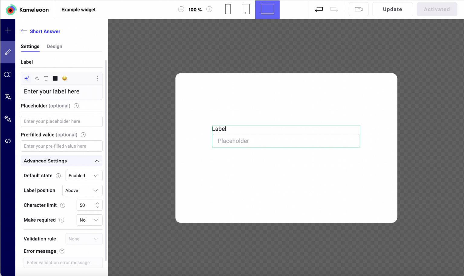
General Settings
- Label/Question: The main prompt/question.
- Placeholder (optional): Text displayed before user input; disappears as soon as the user starts typing.
- Pre-filled value (optional): Inserts a predefined response into the field.
- Default state: Determines whether the field is enabled or disabled on load.
Advanced Settings
- Label position: Position the label above or below the input field.
- Character limit: Maximum number of characters allowed.
- Make required: Forces users to answer a certain question before submitting. A
*is automatically appended to the label. Enabling Make required reveals the Validation rule section, allowing you to define additional input constraints. - Validation rule:
| Rule type | Description |
|---|---|
| Not empty | The input must not be blank. |
| Alphanumeric | Accepts only letters and numbers. |
| Length | Define min/max character count. |
| Regex | Apply a custom regular expression for format control. |
- Error message: Custom message shown when validation fails. The style of the error message can be configured in Design > Answers by selecting the Invalid state.
Multiple Choice
General Settings
- Question: The question text displayed above the answers.
- Answers: Add, remove, or reorder the answer choices. Click Add an answer to create more options.
Advanced Settings
- Multiple selection: Allow users to select more than one answer. If disabled, only one answer can be checked.
- Add "Other": Adds an open-ended text input labeled "Other" so users can write a custom answer.
- Randomize answers: Randomly shuffles the order of the listed answers for each user to reduce selection bias.
- Make required: If enabled, users must select at least one response to submit the survey. A
*is automatically appended after the question label (same style as Question in the Design tab).
Scale
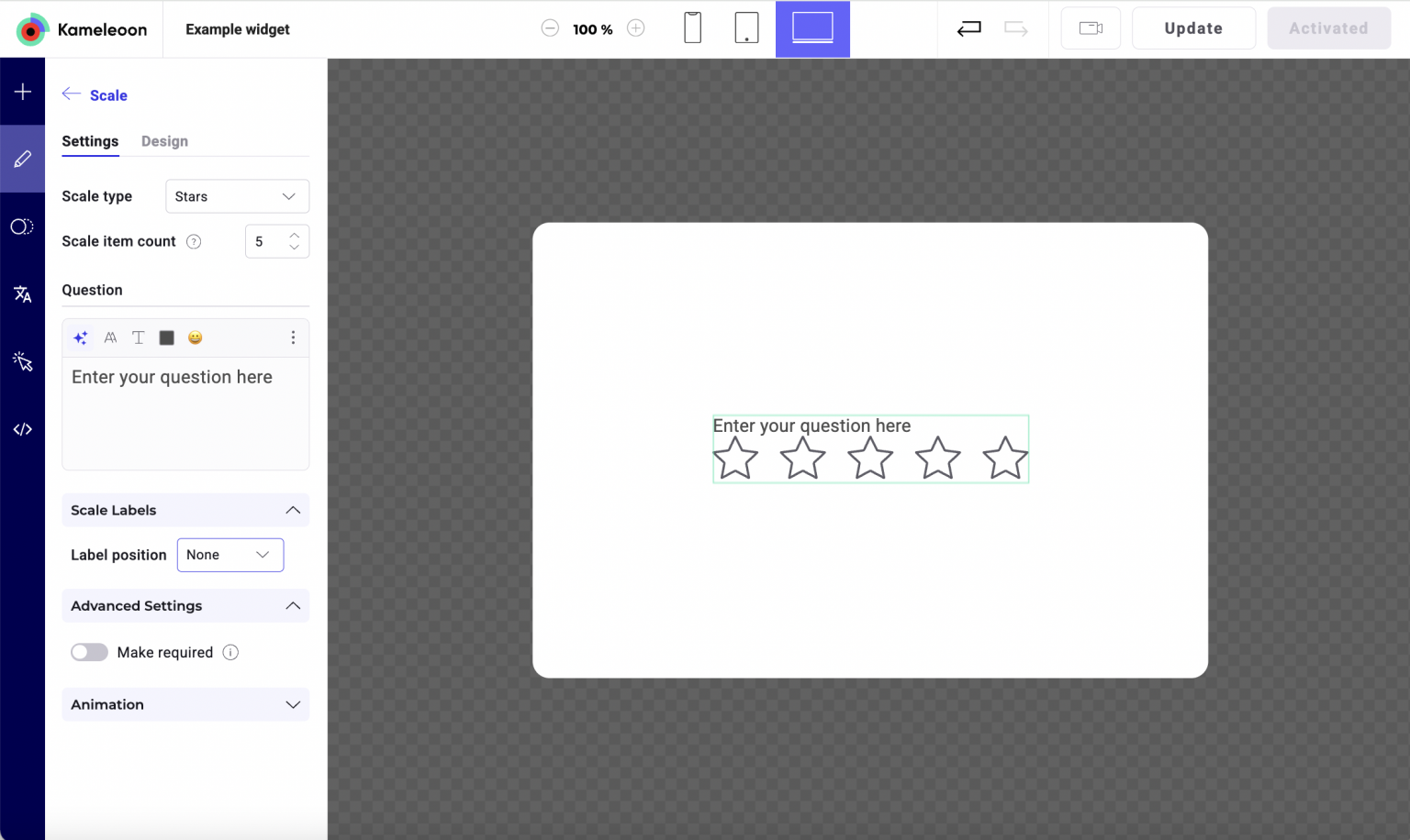
General Settings
- Scale type: Emojis, Stars, Hearts, or Numbers.
- Scale item count: Number of values on the scale (for example, 1-5).
- Question: The main prompt.
Scale Labels
- Label position: Choose to show labels above, below, or not to display them.
- You can customize labels for each scale item.
Advanced Settings
Make required: Mandatory response before submission.
NPS
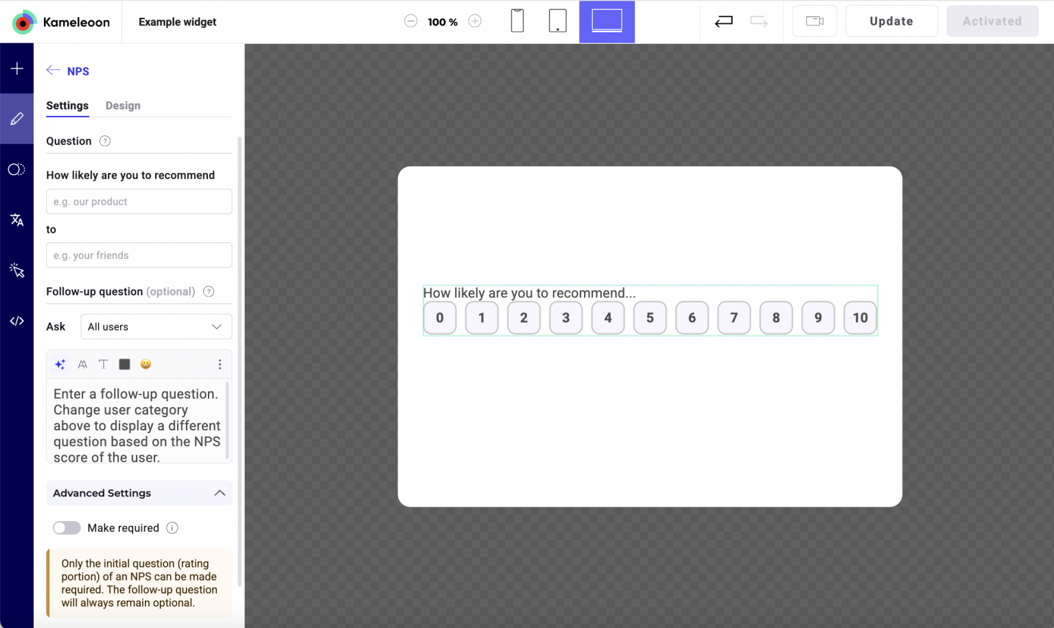
Question structure
- The wording of the NPS question is partially fixed due to standardization. Only portions of the question can be edited. To change the language, go to the Translation tab and set a default language.
Fields
- How likely are you to recommend (X) to (Y)?
- You can edit the product/service and target fields.
- Follow-up question (optional):
- Can be shown to All users, or only to:
- Promoters (score 9-10)
- Passives (score 7-8)
- Detractors (score 0-6)
- Allows conditional follow-up content.
- Can be shown to All users, or only to:
- Make required: Only the initial NPS score can be marked as required. The follow-up question is always options.