
A new campaign results page is available! Discover its features
The tables of results allows you to consult the details of your results, per variation or per goal.
Breakdown and filter tools as well as customized display are there to help you read the results of your experiment. Learn how to use them and you’ll become an expert!
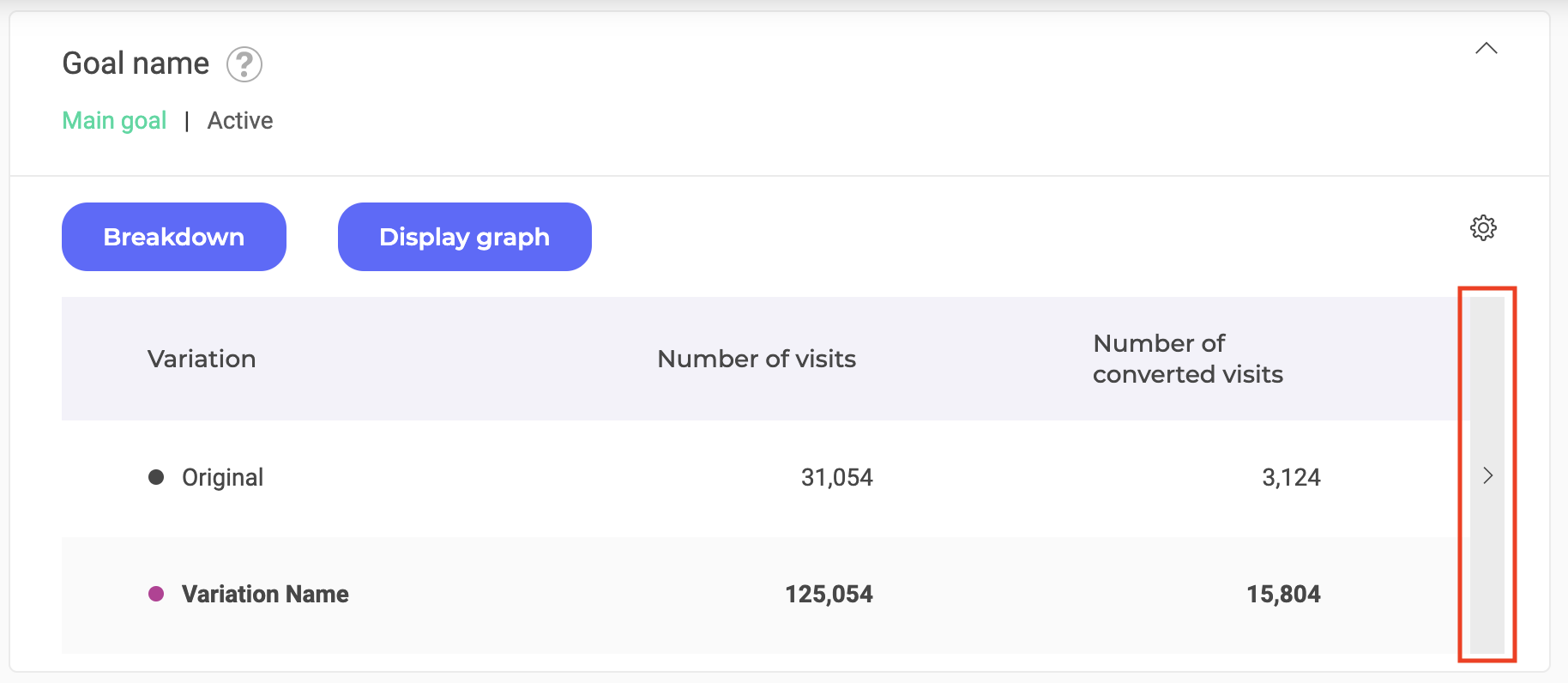
The result tables are located at the bottom of the page, under the graph area.

By default, the table of the main goal is unfolded, its results are directly visible. The tables of secondary goals are folded; just click on it to display their content.
Note: Kameleoon measures unique visitors based on cookies and Local Storage. A cookie is a file placed on a browser that contains an anonymous unique identifier, called the Kameleoon visitor code. It is stored on the user’s browser for 365 days. Each time the same visitor lands on your website, a new visit is created by Kameleoon and ends as soon as no new activity event (page view, scroll, clicks, etc.) has been received by Kameleoon over the last 30 minutes. In other words, a new visit will be created by Kameleoon after 30 minutes of inactivity. For more information on visits, read this article.
View per goal and view per variation
The display of the tables differs depending on whether you have chosen the variation or goal view in the Actions menu of the results page. To learn how to choose between the two types of views, see our article about the actions on the results page.
If you have set the view by goal (default view), each table shows the results of each variation for a goal. Conversely, with the variation view, each table presents the results of each of the goals for a variation.
This article will treat the results tables from the view per goal.
Table header
The header of each table contains the main information about the table:
- The name of the goal;
- A tooltip displaying, on hover, the tag(s) and description associated with the goal;
- The type of goal (primary or secondary)
- The status of the goal (active or inactive).
You will also find, for the goals added after the launch of the experiment, the date on which the goal was added.
Click on the header of a table to fold or unfold it.
Breakdown
Unlike a filter tool, breakdown allows you to view the results in more detail. Click on Breakdown above the table.

You can display the details of your results by browser, operating system, days of the week, etc.
Choose your breakdown and click on the Validate button. You can also apply this breakdown to all goals by checking the corresponding box below the drop-down list.
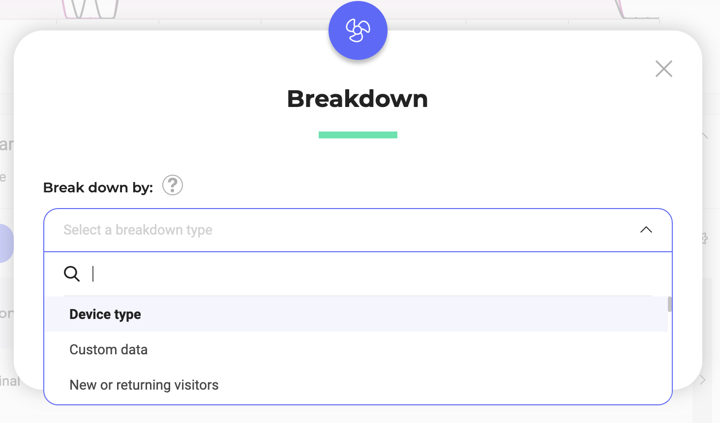
The breakdown criteria available are:
- Device type
- Custom data
- New or returning visitors
- Conversions
- Browser
- Visited page URL
- Acquisition channels
- Traffic type
- Operating system
- Kameleoon segment
- Page title
- Number of pages viewed
- Campaign
- Ad blocker
- Goal achieved
- Landing page URL
- Day of the week
- Workweek and Weekend
- Time spent on the website
- Browser language
- Weather: sky condition
- Time elapsed since last visit
- Day or night
- Weather: temperatures
- Number of visits on the website
- Referring website URL
- Key pages
- SDK
Note: If you want to analyse the impact of specific campaigns on others, you can use the Campaign breakdown. It will breakdown your results according to whether your visitors have been exposed to one of your campaigns (experiment and/or personalization). The specific variation your visitors have seen is then indicated in the table. Learn more about cross-campaign analysis
After validation, you obtain a display of the results corresponding to the selected breakdown. In this example, the selected breakdown concerns the new/returning visitors. The results are distributed between new visitors and returning ones.
Click on the variations to display the results associated with them, according to the chosen breakdown. To do this, click on the arrows on the left of each variation line.
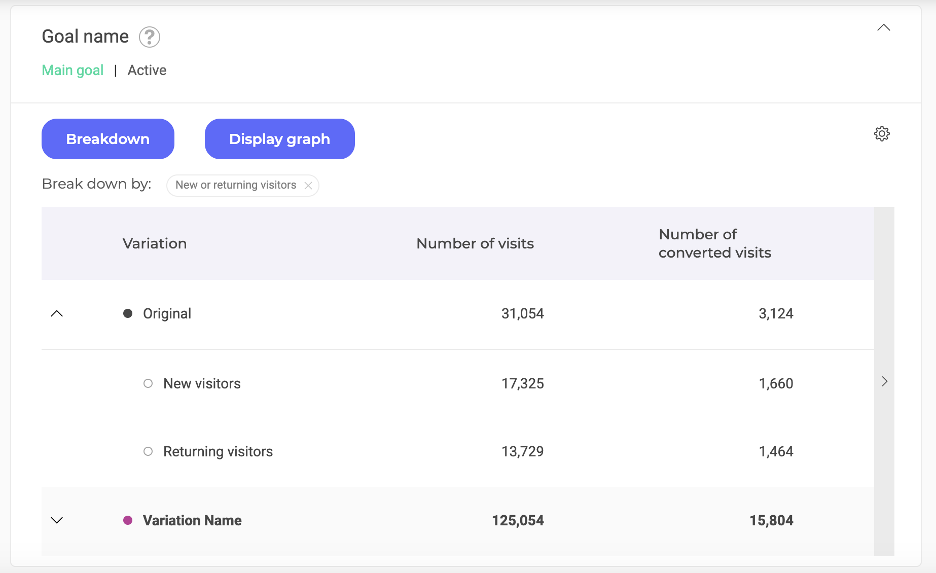
The results then take place taking into account the chosen breakdown.
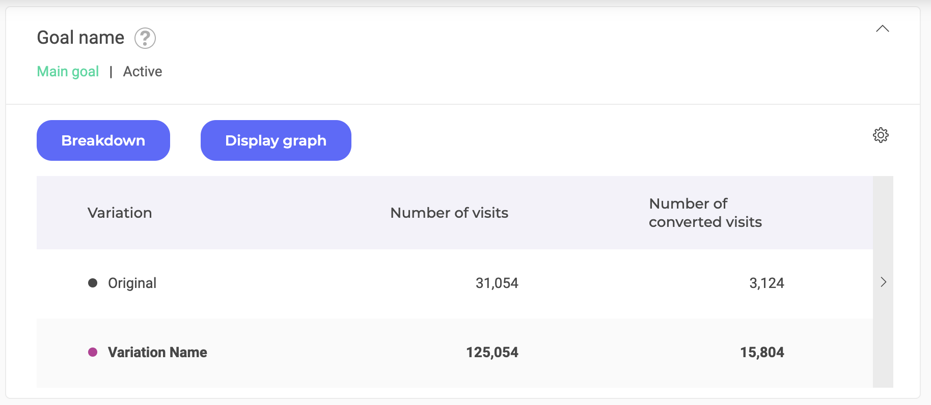
You can hide these details again by clicking on the same arrow.
If you want to delete a breakdown to return to the default view, click on the cross in the label of your breakdown.

Graph
You can also visualize the data with a graph. It only concerns the goal presented in the table. To do so, click on the Display graph button, just to the right of the Breakdown one, in order to make the section appear.

When you activate the graph display, the Display Graph button changes to Hide Graph.
Note: If you have already set a breakdown, it automatically applies to the graph. By clicking on the point, you can display the breakdown on the graph; when the circle is empty, the breakdown is hidden; when full, it is displayed.
To learn more about viewing and adjusting the graph, you can visit our Evolutive curve article.
Read the results tables
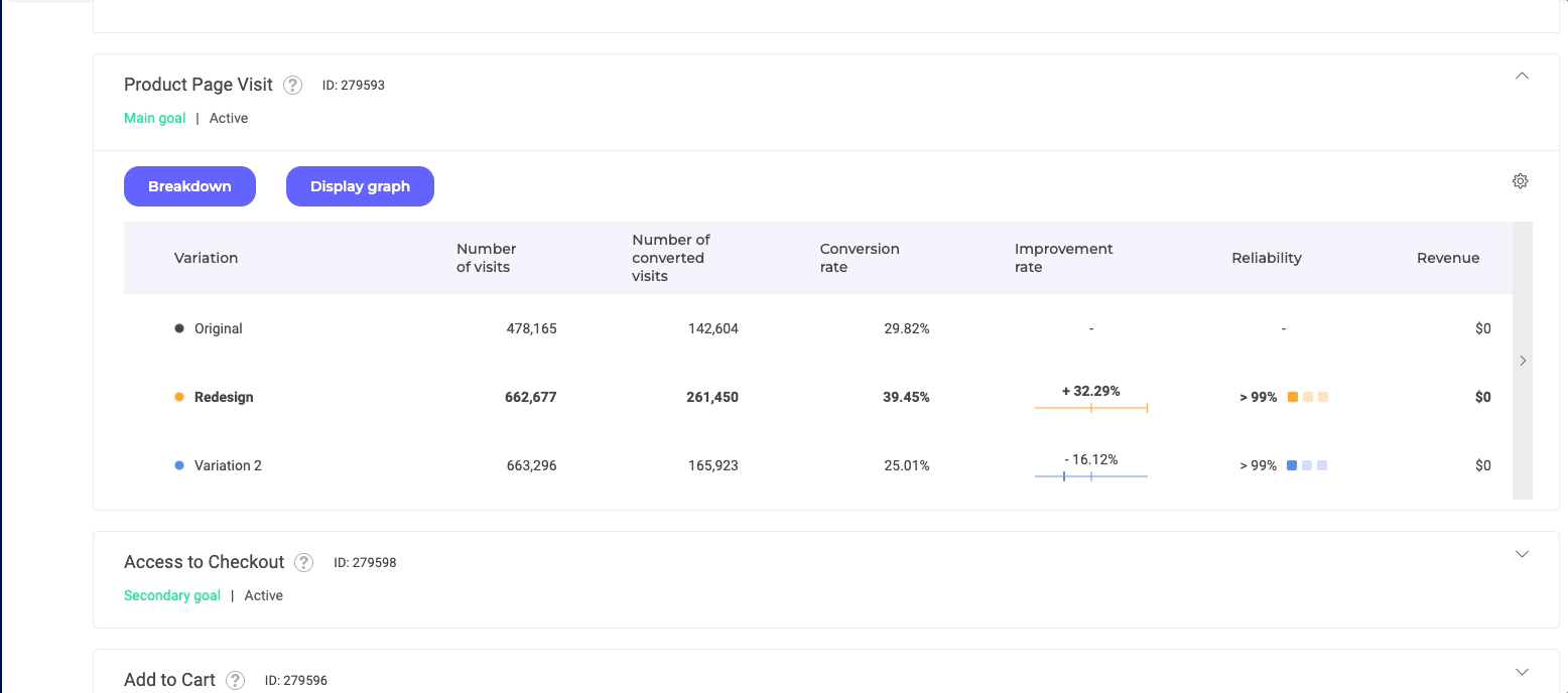
Winning variation
The name of the winning variation (for the goal) appears in bold so it is immediately recognizable.
Organization of columns
When view per goal is selected, each table displays the results related to a goal.
Each line represents a variation and each column a data.
Note: With variation view, each table presents the results related to a variation. Each line represents a goal and each column a data.
To scroll the table and view the following data, click the arrow on the right of the table.
By default, all columns are displayed. However, you can show or hide some of them by selecting/de-selecting them.

To do this, click on the settings icon located at the top right of the table and check or uncheck the data columns.
- Those that are checked appear;
- Those that are unchecked do not appear.

Still in the settings menu, you can change the order of the columns by clicking on Change order of columns.

With click-and-drop, you move the labels to rearrange your table.

You can re-switch to the choice mode by clicking on Choose displayed columns.

Note: The proposed data depend on several criteria: the type of goal (for example, for the goals of the Transaction type, the data Average basket value is proposed); the type of view (for example, in the view per variation, the Number of visits column is never displayed.
When you click on the title of a column, the table is automatically reordered (with the exception of the original variation, which always remains at the top of the table) and the variations lines are organized:
- In descending order if the arrow is pointing down (this is the case by default);
- In ascending order if the arrow is pointing upwards.
For example, if you click on the title of the column Number of visits, the variation presented first will be the one that counts the most visits, and so on until the variation that counts the least and is at the bottom of the board.
Only the variation column is not clickable.
If you save the display settings (via the Actions menu), the presence/absence of the columns and their order will be saved. In this way, you will find the same display on your next visit. For more information, see our article on saving display settings.
Data
All columns in the result tables, except for the variations, have a title with a tooltip. This tooltip appears on hover.

The column headings are explained by these tooltips. You can also consult our Results page lexicon to find the definition of all key terms.
We will only detail here the data that presents a double level of information: the improvement rate and the indicator of reliability.
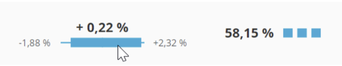
Improvement rate
This column shows the improvement rate of the conversion on your goal. It is always in comparison to the original (which always has an improvement rate of 0). It therefore reflects the improvement of the conversion rate in comparison to this reference.
The percentage in bold just above the color block corresponds to the average improvement rate observed during previous visits. Here, this rate is 3.88%. In other words, on this goal, the experiment revealed a 3.88% improvement in conversion over the conversion rate of the original.

On hover, two percentages appear: this is the confidence interval. We compute the confidence interval boundaries at the global reliability necessary to call a winner of your website. For example here the confidence level is 95%, hence the confidence interval we will compute will have 95% chance to hold the true improvement rate.
Do note that once the interval is computed it either holds the true improvement rate or not. Here for example, we are 95 % confident that the improvement rate lies between the minimum (-2.54%) and the maximum (+10.31%).
The interval is graphically represented by the colored rectangle is also an indicator it visually represents this interval with respect to zero.
In the example below, we are 95% confident that the improvement rate is between -1.88% and + 2.32%, so almost as much probability of being negative as positive, which is represented by the shape of the blue rectangle.
The confidence interval always has a probability of 95%.
If you would like more details on how Kameleoon’s statistic engine works, you can read our Statistical paper.
Reliability
This indicator represents the probability of observing less improvement if the winning variation was not better. If it is high enough, it helps us to refute the hypothesis that the winning variation brings no improvement to the conversion rate. Usually one uses the confidence level of 95%.
The experiment is only reliable if it has been applied to a sufficiently large amount of visitors. If the number of tested visitors is too low, the experiment loses its value.
Your experiment is not considered complete until this reliability rate stabilizes over time. This rate is considered stable if it remains within a range of +/- 5 points. A visual indicator reflects the stabilization of the rate: if the 3 boxes light up, your rate is stable and your experiment is over!
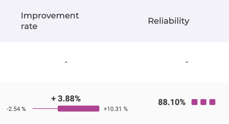
- Not stable: 0/3 boxes
- Stable for 1 to 3 days: 1/3 boxes
- Stable for 4 to 6 days: 2/3 boxes
- Stable for 7 or more days: 3/3 boxes
Note: This indicator makes it possible to visualize, immediately and very easily, the evolution of the reliability. However, when reading your results using the converted visit / visitor view, you can also consult the graph showing the evolution of the confidence rate over time (by selecting Reliability in the Graph section of the block). When the curve flattens, it means that the results of your experiment are stabilized and that you can use this data with confidence.

Hover overlay for continuous metrics
To enhance the interpretation of continuous metrics, Kameleoon provides a detailed hover overlay feature. This overlay appears when hovering over non-binomial metrics such as Revenue per visit/visitor or Average cart value, offering a summary of the analysis for these metrics.


- Improvement Rate: Displays the computed improvement rate for the metric, color-coded to indicate positive (green) or negative (red) changes. It also includes a confidence interval calculated using the Frequentist method.
- Reliability: Indicates the reliability of the metric, showing green if the reliability exceeds the predefined confidence level, otherwise red.
- Confidence Interval Table: The min and max values are the bounds of the confidence interval around the improvement rate. The values are displayed in green if the are positives, and in red when they are negatives.
If you would like more details on how Kameleoon’s statistic engine works, you can read our Statistical paper.
An icon to the right of each variation name allows to open the variation menu with a simple click.

Four actions are then possible.

This icon allows you to view the variation. Click to open a new browser tab showing the simulation mode, directly applied to the variation.

Click this option to display the traffic allocation pop-in.

You can then modify the allocation. There are two ways to do this: either use the cursor while holding the click, or double-click on a percentage to replace the value manually.

You can also deviate 100% of the traffic to the concerned variation. This means that all visitors will see this variation.
A pop-in opens when you click. You can then confirm the deviation or cancel the action (and change nothing).
By default, the latter is the original. For example :
- If the original is the reference, the option Set as reference variation is not available for the original (the line is then grayed out);
- If Variation 1 is the reference, the option is disabled for this variation; however, it is available for the original and for all other variations.
Note: By default, the box of the original is checked and it is not for variations.

Checking a variation identifies it immediately as the only reference variation.
Note: There can only be one reference variation.If you uncheck a variation, the original automatically becomes the reference.
Changing the reference variation has an impact on the results. The improvement rates are automatically recalculated according to this new reference variation.
You can also click on the variation line to deploy the data associated with it.
