A new campaign results page is available! Discover its features
The results chart allows you to view the details of your results, by audience type or goal.
Breakdown tools, filters and customized display are there to help you read the results of your personalization. Learn how to use them and you’ll become an expert!
The results charts are located at the bottom of the page, under the graph area.
By default, the table of the main goal unfolds, its results are directly visible. The tables of secondary goals are folded; just click on them to display their content.
View per goal and view per audience type
The display of the charts differs depending on whether you have chosen the audience type or goal view in the Actions menu of the results page. To learn how to choose between the two types of views, see our article about the actions on the results page.
If you have set the view by goal (default view), each table shows the results of each type of audience for a goal. With the audience type view, each table presents the results of each of the goals for an audience type.
This article takes up the example of view by goal results charts.
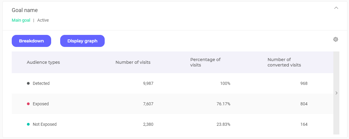
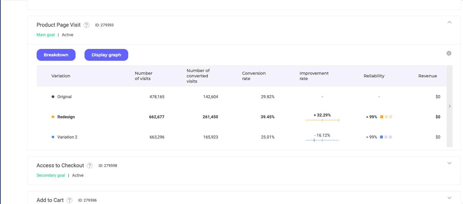
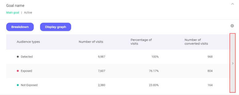
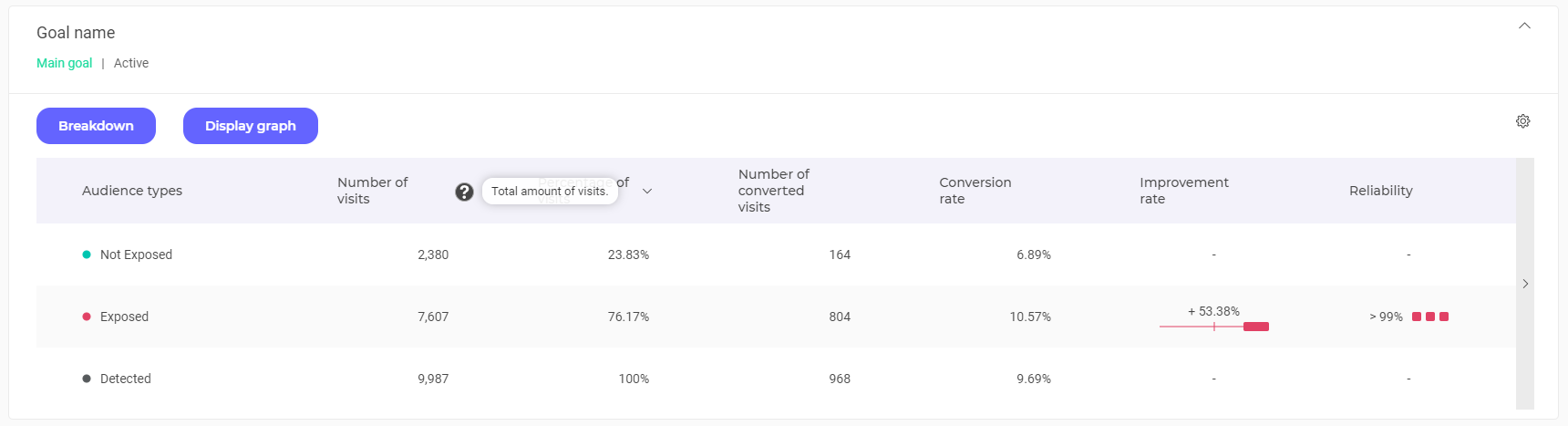
Chart header
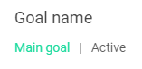
The header of each table contains the main information :
- The name of the goal;
- a tooltip displaying, on hover, the tag(s) and description associated with the goal;
- the type of goal (primary or secondary)
- the status of the goal (active or inactive).
You will also find, for the goals added after the launch of the experiment, the date on which the goal was added :
Click on the header of a chart to fold or unfold it.
Breakdown
Unlike a filter tool, breakdown allows you to view the results in a more detailed way. Click on the Breakdown button above the chart.
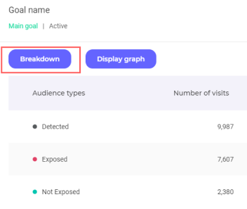
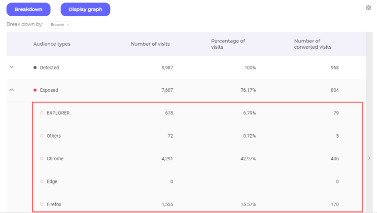
You can display the details of your results by browser, operating system, days of the week, SDK, etc.
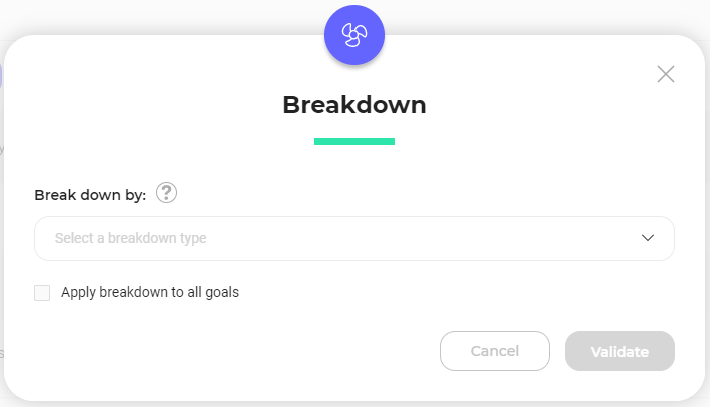
Choose your breakdown and click on the Validate button. You can also apply this breakdown to all goals by checking the corresponding box below the drop-down list.
Note: If you want to analyse the impact of specific campaigns on others, you can use the Campaign breakdown. It will breakdown your results according to whether your visitors have been exposed to one of your campaigns (experiment and/or personalization). The specific variation your visitors have seen is then indicated in the table.
Note : Only available breakdowns are clickable. A padlock may appear in front of some of them to indicate that they are not available.
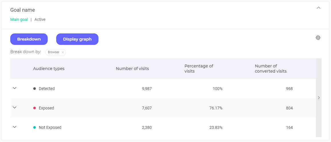
After validation, you obtain a display of the results according to the selected breakdown. In this example, a breakdown by browser has been selected. The results are distributed according to the different browsers used by your visitors.
Click on the variations to display the results associated with them, according to the chosen breakdown. To do this, click on the arrows on the left of each variation line.
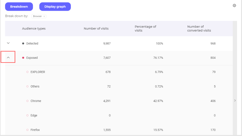
The results are displayed according to the chosen breakdown.
You can hide these details again by clicking on the same arrow.
If you want to delete a breakdown and return to the default view, click on the cross in the label of your breakdown.

When you activate the graph display, the Display Graph button changes to Hide Graph.
Note: If you have already set a breakdown, it automatically applies to the graph. By clicking on the point, you can display the breakdown on the graph; when the circle is empty, the breakdown is hidden; when full, it is displayed.
To learn more about viewing and adjusting the graph, you can visit our article about the evolutive curve.
Read the results charts
Audience types
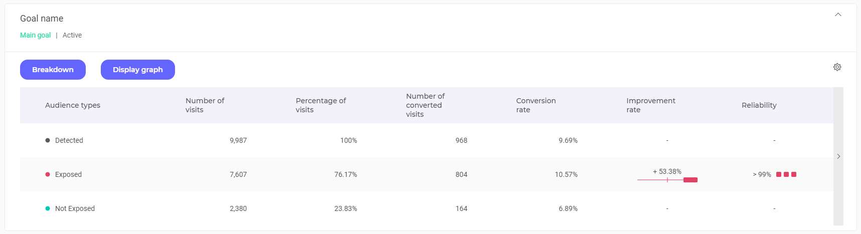
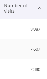
There are 3 audience types :
- detected visitors;
- exposed visitors;
- non-exposed visitors.
You will find in your charts 3 lines representing these 3 audience types.
Between exposed and non-exposed, the type with the most elevated conversion rate will appear with a line bold.
To better understand the different types of audience, you can read this article.
Organization of columns
When view by goal is selected, each table displays the results related to a goal.
Each line represents an audience type and each column a data.
Note : With the audience type view, each table presents the results related to an audience type. Each line represents a goal and each column a data.
To scroll the table and view the following data, click the arrow on the right of the table.
By default, all columns are displayed. However, you can show or hide some of them by selecting / deselecting them. To do this, click on the settings icon located at the top right of the table .

Check or uncheck the data columns :
- Those that are checked appear;
- those that are unchecked do not appear.
Still in the settings menu , you can change the order of the columns by clicking on .

With click-and-drop, you move the labels to rearrange your table. You can re-switch to choice mode by clicking on:

Note : The suggested data depends on several criteria : the type of goal (for example, for the Transaction-type goals, Average cart value data is suggested); the type of view (for example, for the view by variation, the Number of visits column is never displayed). For more information on visits, read this article.
When you click on the title of a column, the table is automatically reorganized and the audience type lines are shown :
- in descending order if the arrow is pointing down (this is the default case);
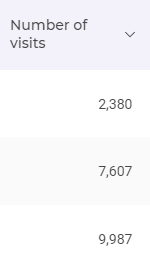
- in ascending order if the arrow is pointing upwards.
If you save the display settings (via the Actions menu), the presence/absence of the columns and their order will be saved. In this way, you will find the same display on your next visit. For more information, see our article on saving display settings.
Data
All columns in the result tables, except for the audience types, have a title with a tooltip. This tooltip appears on hover.
The column headings are explained by these tooltips. You can also view our Results page glossary to find the definition of all key terms.
We will see in detail only data that presents a double level of information : the improvement rate and the indicator of reliability.
Improvement rate
This column shows the improvement rate of the conversion on your goal. It is always in comparison to the conversion rate of the non-exposed traffic (which always has an improvement rate of 0). It therefore reflects the improvement of the conversion rate in comparison to this non-exposed traffic.
The percentage in bold just above the color block indicates the average improvement rate observed during previous visits. Here, this rate is +53.88%. In other words, on this goal, the personalization brought on a 53.88% improvement in conversion.
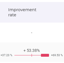
On hover, two percentages appear: this is the confidence interval. We compute the confidence interval boundaries at the global reliability necessary to call a winner of your website. For example here the confidence level is 95%, hence the confidence interval we will compute will have 95% chance to hold the true improvement rate.
Do note that once the interval is computed it either holds the true improvement rate or not. Here for example, we are 95 % confident that the improvement rate lies between the minimum (+37.23%) and the maximum (+69.53%).
The interval is graphically represented by the colored rectangle is also an indicator it visually represents this interval with respect to zero.
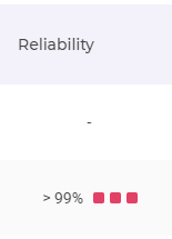
Reliability
This indicator represents the probability of observing less improvement if the winning variation was not better. If it is high enough, it helps us to refute the hypothesis that the winning variation brings no improvement to the conversion rate. Usually one uses the confidence level of 95%.
The personalization is only reliable if a sufficiently large number of visitors has been exposed. If the number of tested visitors is too low, the campaign loses its value.
Your campaign is not considered complete until this reliability rate stabilizes over time. A visual indicator reflects the stabilization of the rate : if the 3 boxes light up, your rate is stable.
Note: This indicator makes it possible to immediately and very easily visualize the evolution of reliability. Just watch the boxes. However, when reading your results using the converted visit / visitor view, you can also view the graph showing the evolution of reliability over time (by selecting Reliability in the Graph section of the block).