
A new campaign results page is available! Discover its features
The graph allows you to visualize the evolution of the different data of the results page over time.
The x-axis displays the time scale, the y-axis the value of the data.
To view the comparative view, click the Graphs tab at the top of the graph area.
View per goal and view per variation
The display of the graph differs depending on whether you have chosen the view per variation or per goal in the Actions menu of the results page. To learn how to choose between the two types of views, see our article dedicated to actions on the results page.
If you have set the view per goal (default view), the graph will represent a goal and each curve will represent, for this goal, the evolution of the data of a variation in time.
On the contrary, with the view per variation, the graph will represent a variation and each curve, for this variation, the evolution of the data of a goal in time.
In this article, we will take as an example a graph displayed according to the view per goal (view by default).
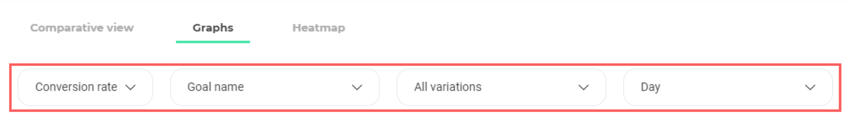
Graph configuration
The configuration of the graph display is in 4 steps:
- The choice of the data to display;
- The name of the goal/variation to display;
- The choice of goals/variations to display;
- The fineness of grouping data.
Choose data to display
The graph can display different types of data:
- The conversion rate;
- The number of visits / visitors;
- The number of conversions;
- The reliability rate.
By default, the data displayed on the graph is the conversion rate.
To select another data, click the first drop-down menu to display the different types of data available.
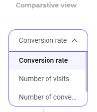
Just click on the type of data you want to display in the graph to select it.
Choose goal to display
In the second drop-down menu, select the goal for which you want to view the results. The curves of the displayed variations will present the results on this goal.
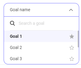
Note :If you have chosen a view per variation, you will select from this drop-down menu the variation to display.
Like everywhere else on the results page, the main goal is identifiable by the little black star that accompanies it.
Choose variations to display
In the third drop-down menu, select the variations to display in the graph.
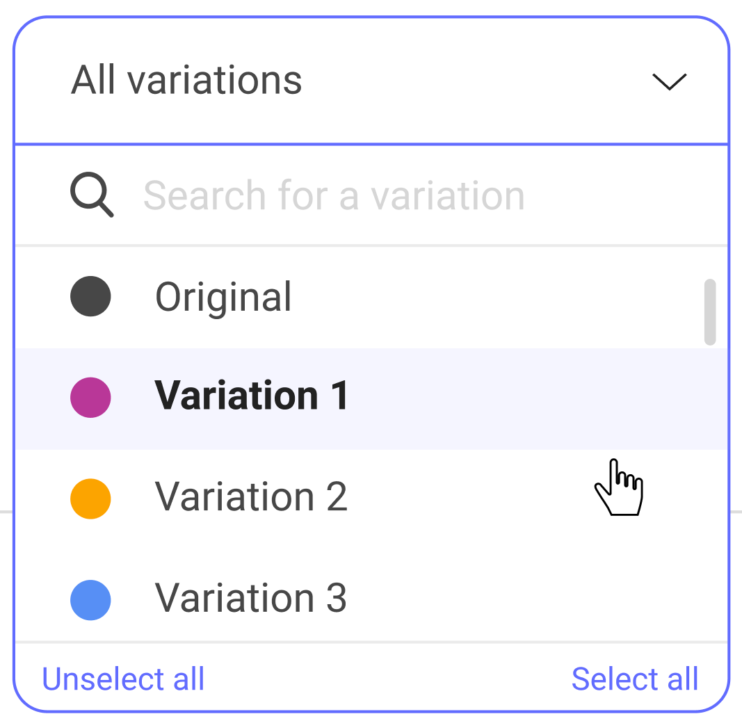
Click on a variation to select or deselect it. Two buttons also allow you to select or unselect everything.
A selected variation is accompanied by a full colored circle, a deselected one by an empty colored circle and a disabled one is grayed out and displayed at the end of the list.
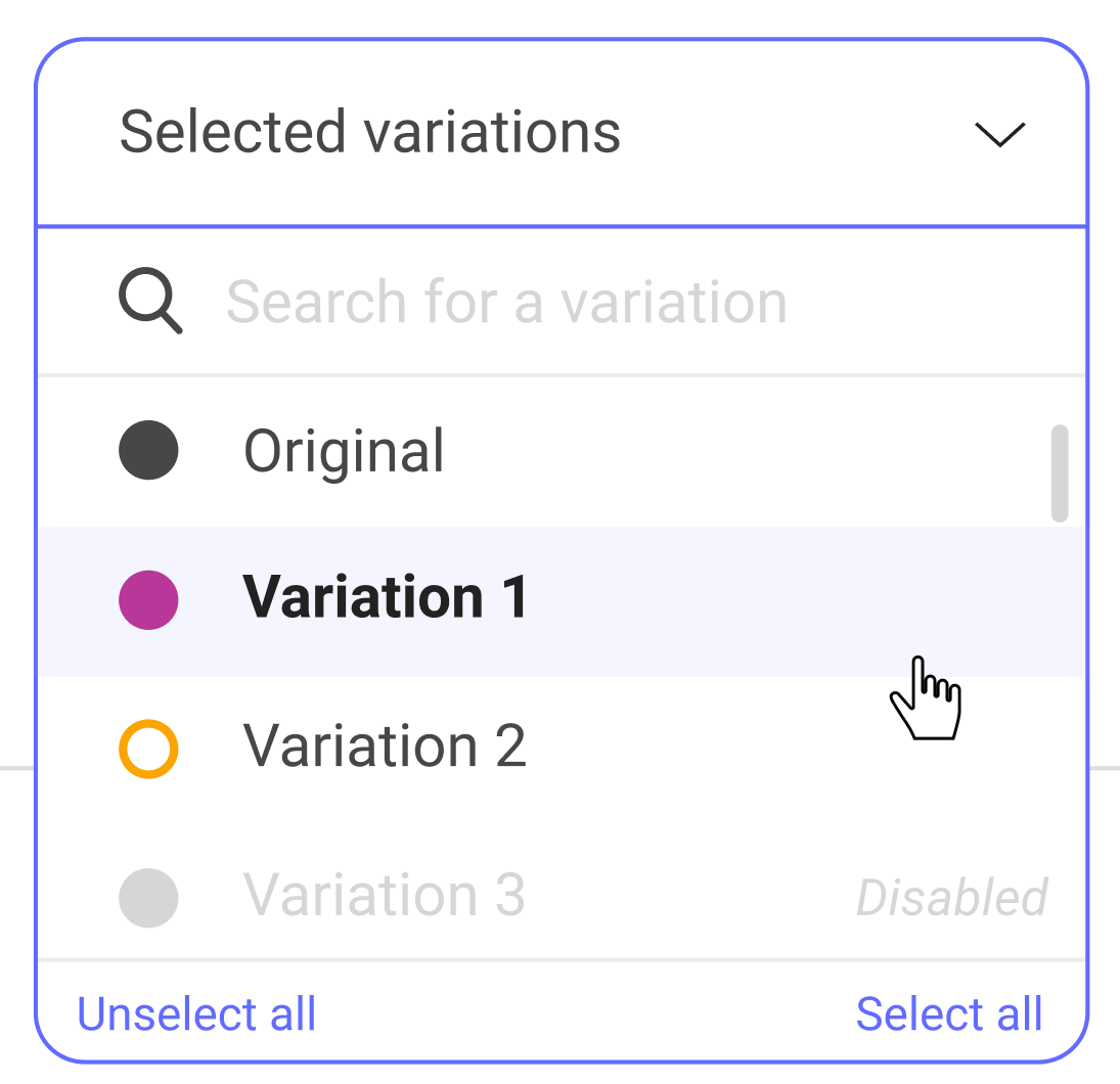
In this example, variation 1 is selected, variation 2 is not, and variation 3 is disabled.
Each selected variation will be represented by a curve of the color assigned to the variation.
Choose the fineness of grouping data
Different options for grouping data are available in order to adapt the display of your results to your experiment duration or the date range you set.
You can group data by:
- Months;
- Weeks;
- Days ;
- Hours.
By selecting Month from the drop-down menu, the x-axis on the graph is graduated from month to month and each month is a point that groups together all the data measured over the month. The same goes for Weeks, Days and Hours.
You can choose the most relevant display for your experiment. If, for example, your experiment runs through a period of 2 months, it is better to choose a grouping by weeks. A display per month would not have sufficient finesse (only 2 points) and a grouping by days would have excessive finesse.
On the other hand, if you are interested in a range of dates that runs through 2 weeks, a grouping per day is recommended.
Read the graph
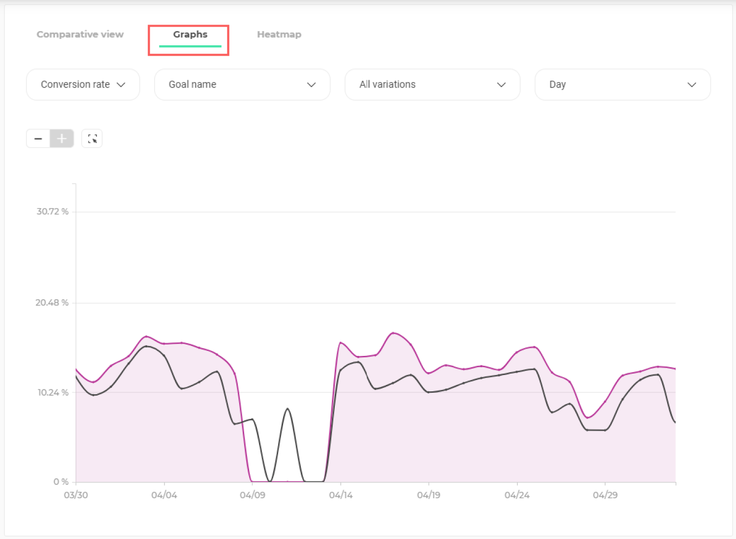
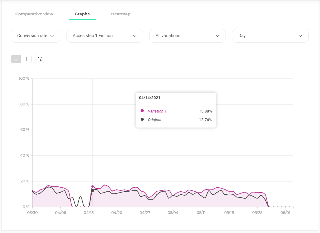
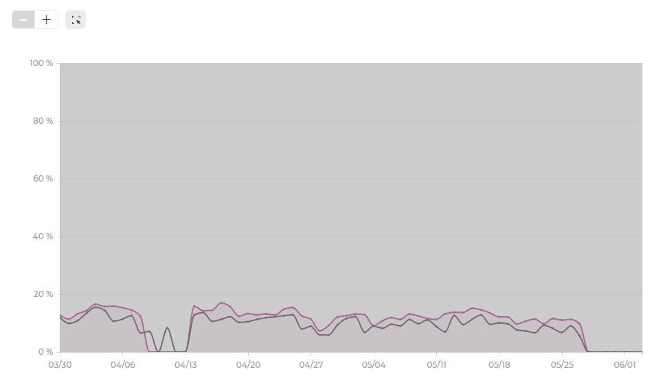
The evolution curve presents the evolution of data over time.

The graph above represents the evolution of the conversion rate (y-axis) over time (x-axis). Each curve represents one of the 3 variations displayed and the results are those related to Goal 1. The graduation of the time scale is made per day.
View details of a point in the graph
On hover, the detail of the results appears.
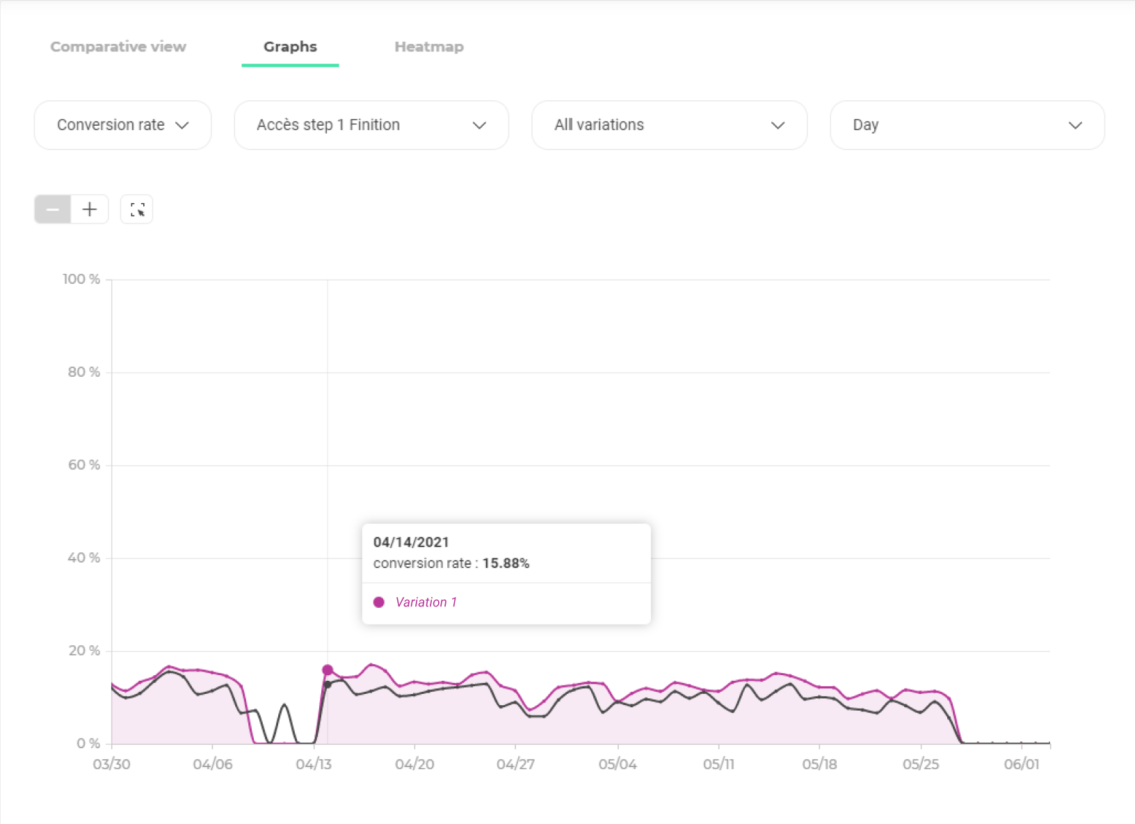
In a tooltip are displayed:
- The corresponding date on the x-axis;
- The value of the corresponding data on the y-axis;
- The name of the hovered variation.
By clicking on this point, the tooltip displays the value of the data for each variation on that date.
Click elsewhere on the page to close the tooltip.
Use the zoom
Above the graph, on the left, three zoom tools are available:
- A dezoom tool;
- A zoom tool;
- A free zoom tool.
Zoom (+) and zoom out (-) tools
Click the + or – button to zoom in or out on the graph. The zoom – reduces the scale of the ordinate axis (data value) and the zoom + enlarges it. The use of zoom has no impact on the x-axis. The displayed date range and scale remain unchanged.
When + and – zooms are at their maximum, the buttons are dimmed and can not be used anymore.
Free zoom tool
The free zoom tool allows you to freely zoom in on the graphic area of your choice.
To use it, first click on the free zoom icon:

The graph area gets gray:
To define the area you want to zoom in, click in the grayed area and while holding your mouse click, drag the mouse diagonally to define a rectangle on the area you want to zoom.
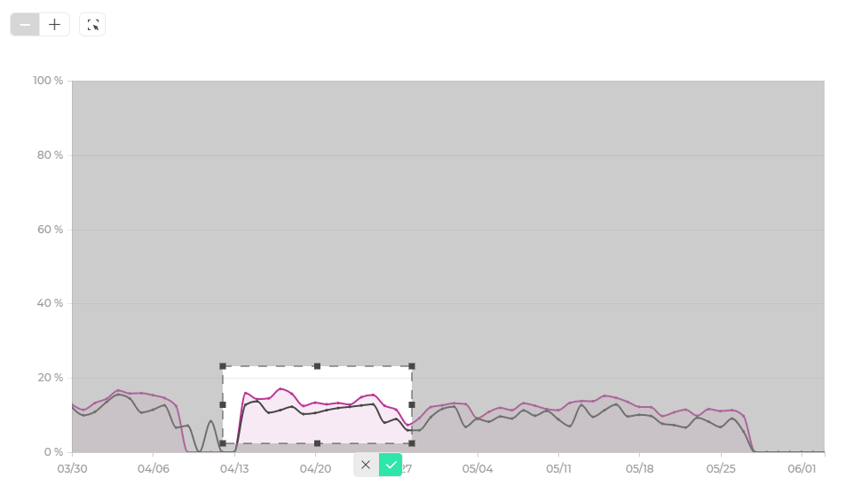
The zoom area thus defined appears in light. When the area meets your needs, release the click. Two buttons appear at the bottom right of the rectangle.
Click on the validation button to confirm your selection and refresh the graph according to this one or click on the cross to cancel your selection and exit the free zoom mode.
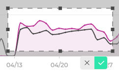
By validating your selection, the graph view adapts. The selected area stretches to fill the entire chart area.
To exit the free zoom mode and return to the default view, click the free zoom button again.
