
This article is about Personalization.
A new campaign results page is available! Discover its features
The main results of your personalization are displayed on the top of the results page.
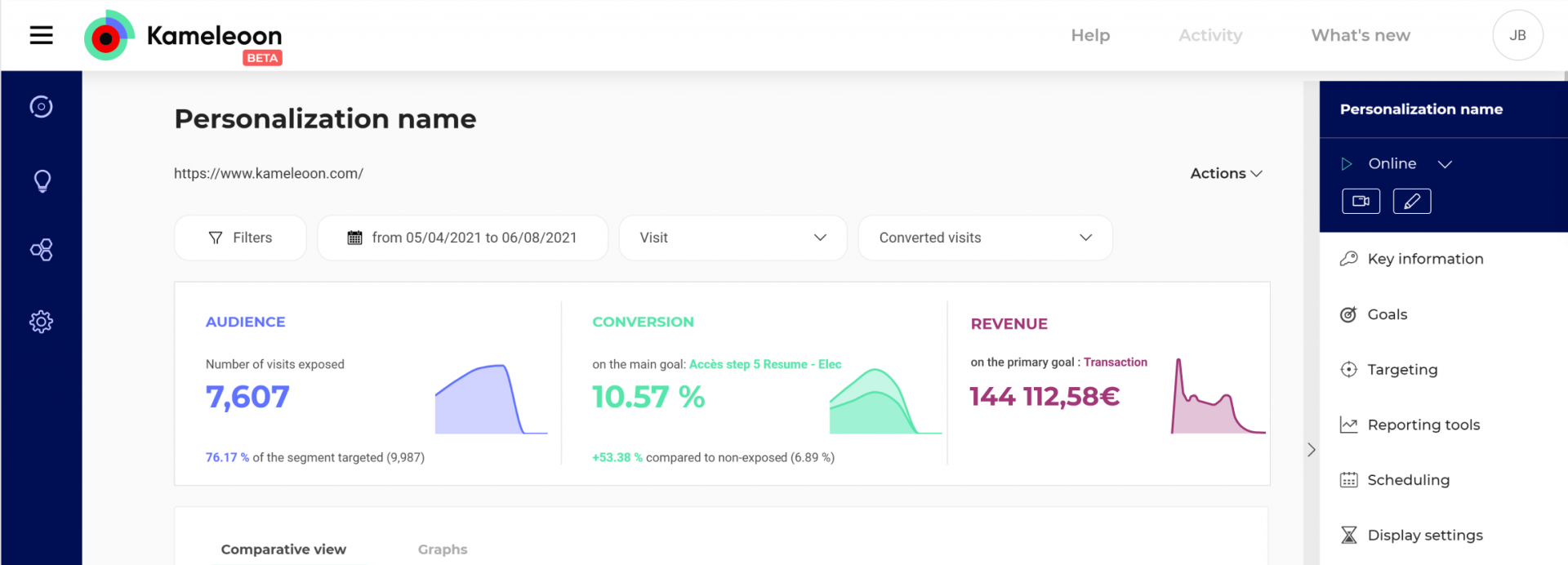
You will be able to see at a glance audience, conversion rate on the main goal and if applicable, the revenue.
Audience
Audience indicates the number of exposed visitors or visits (according to the option you selected in the settings).
(To better understand the different types of audience, you can read this article.)
It gives the percentage of exposed visitors among all targeted visitors, with in parentheses the total number of targeted visitors (or visits, according to the option selected in the settings) – without decimal numbers. Note that we don’t display this part if 100% of targeted visitors were exposed. Let’s say 98,57% of targeted visitors, or 25,329 out of 25,697 have been exposed. The graph on the right represents the evolution of the number of exposed visits. The X-axis indicates the time as defined in the date range, the Y-axis shows the number of visits or visitors.
On hover on the block, a tooltip is displayed (always at the same position), only the text changes: in the first line, date of the last day defined by the date range, and in the second lin, the: number of visitors or visits on this day.
For more information on visits, read this article.
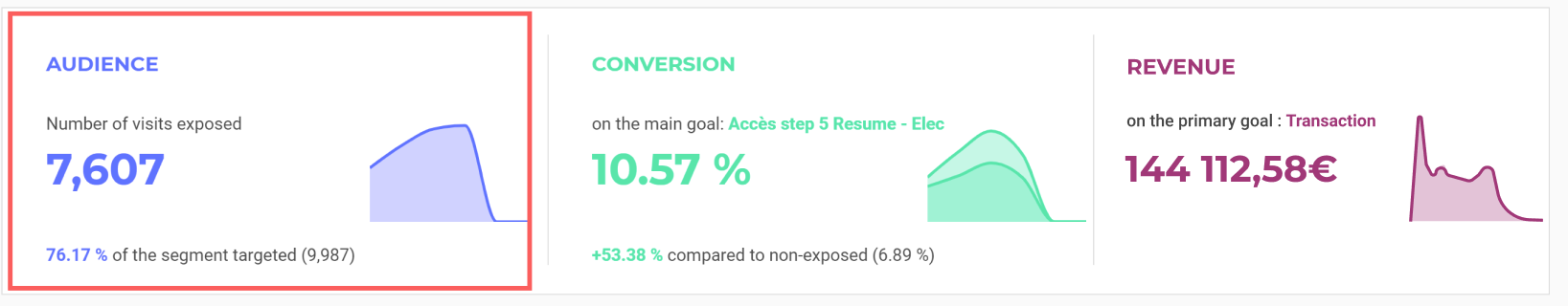
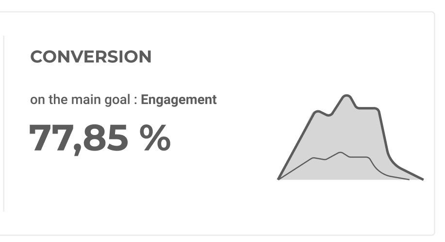
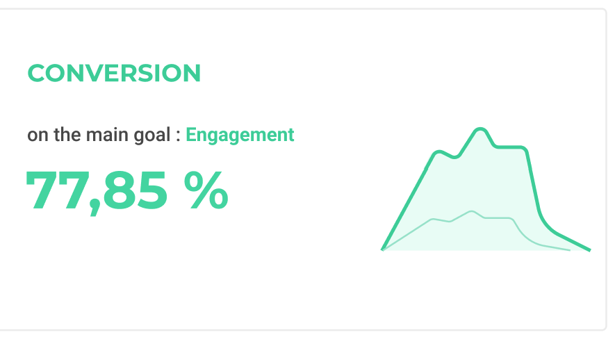
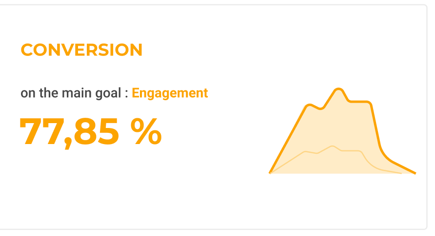
Conversion
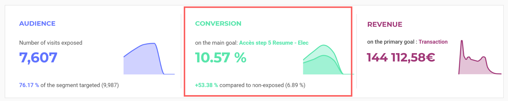
This is the figure you seek to optimize during a personalization. It is the percentage of the number of visitors/visits converted compared to the total number of exposed visitors/visits .
Next comes the improvement rate. It shows the improvement in the conversion rate of exposed visitors/visits as compared to targeted but not exposed visitors / visits.
Note that we do not display this part if 100% of targeted visitors were exposed.
The graph represents the evolution of conversion rate for exposed visits vs targeted but not exposed ones. The bold line represents exposed visits and the thinner one is for the targeted but not exposed ones. The X-axis shows the time defined in the date range, the Y-axis shows the conversion rate.
Note that the colors change according to 2 data:
- If there is not enough reliability (under 95%), the name, conversion rate, improvement rate and the graph are grey:
- If there is enough reliability (over 95%) and the improvement rate is positive, name and conversion rate are green:
- If there is enough reliability (over 95%) and the improvement rate is negative, the name and conversion rate are orange:
On hover on the overall Conversion block, a tooltip is displayed, always at the same position, but with different content:
- in the first line: date of the last day indicated in the date range;
- and in the second line: conversion rate of exposed visitors or visits on the main goal during the last day of the date range.
Information
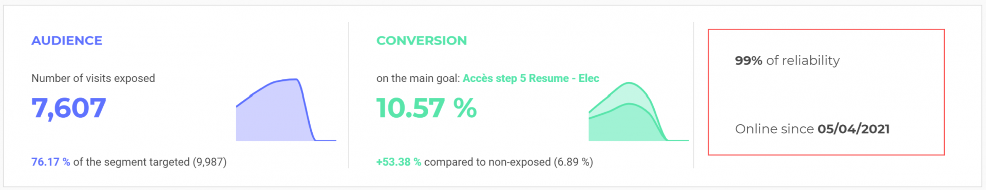
The info part includes the following components :
- the reliability rate (it does not appear if 100% of the targeted segment is exposed to the personalization);
- the status of the personalization (online, re-launched, paused, planned or stopped).
Particular case : revenue
When there is a custom goal linked to revenue data, the layout is different.
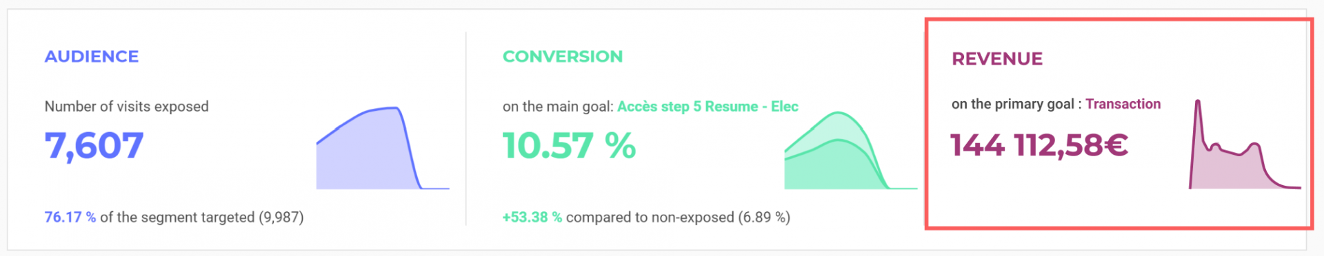
The first two parts are the same as the one described above. The info part is below (like in tablet mode). And a new part is added : Revenue.
If the main goal is linked to revenue, then we indicate the main goal. If several goals are revenue-related, the one with the highest amount is indicated.
The total revenue generated during the selected date range appears. We also compare this figure with the one generated by targeted but non-exposed visitors/visits :
(total of generated revenue by exposed visitors/visits) / (Total revenue generated by not exposed visitors/visits).
The graph represents the cumulated revenue. The X-axis indicates the overall period defined in the date range and the Y-axis shows the revenue.
On hover on the overall Revenue block, a tooltip is displayed, always at the same position, but with changing content :
- in the first line: date of the last day indicated in the date range (defined in settings);
- and in the second line: cumulated revenue until the last day.
