The comparative view allows you to compare, on a spider web graph, the goal improvement rates set on the experiment.
The comparative view is only available if at least two goals are configured on your experiment.
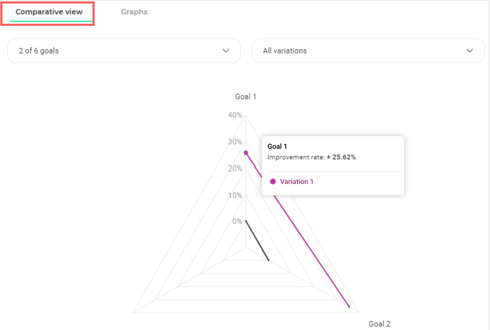
To display the comparative view, click the “Comparative view” tab at the top of the chart area.
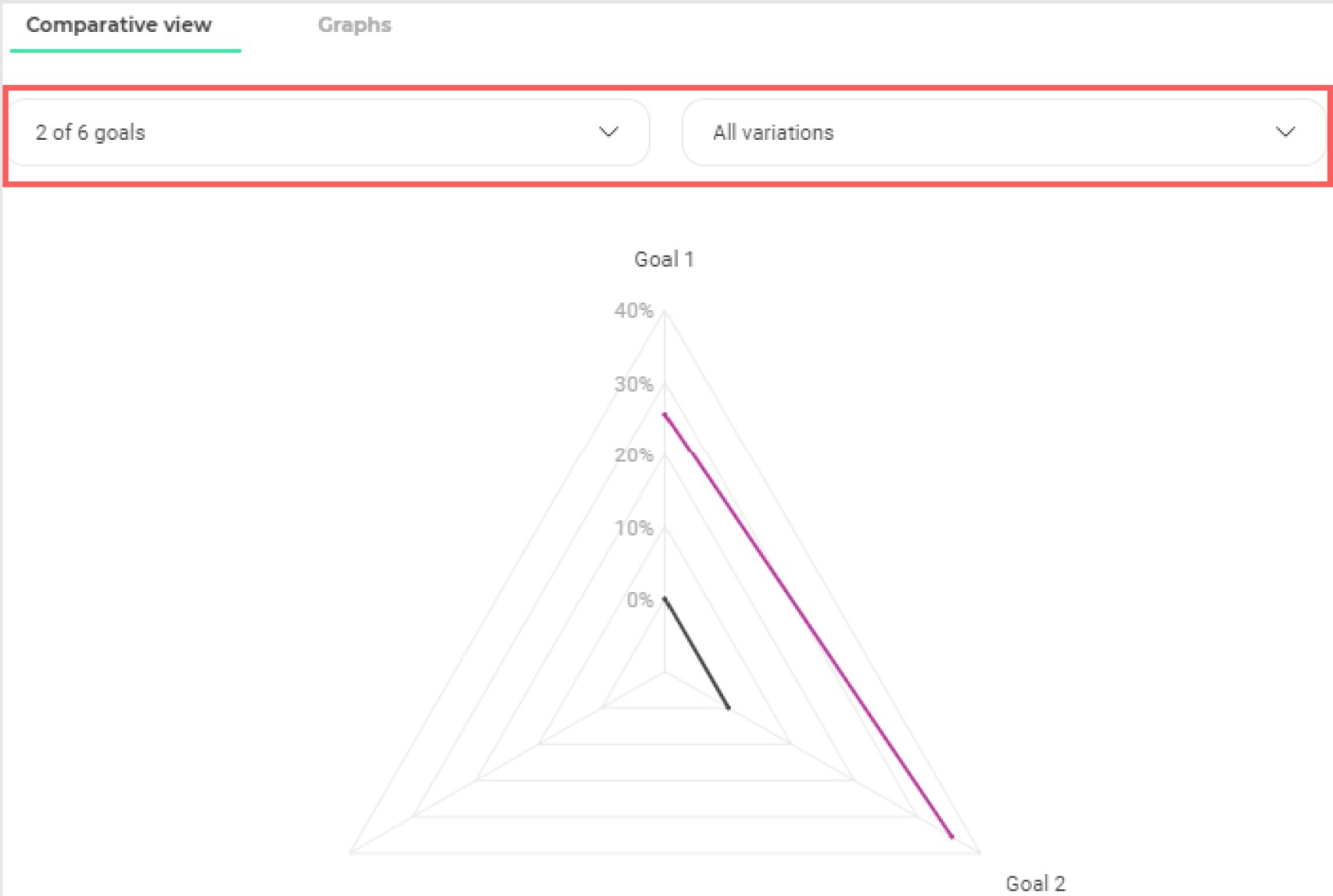
Choice of goals and variations
At the top left of the chart area, two drop-down menus allow you to select the goals and variations you want to display in the comparative chart.
Choice of displayed goals
To choose the goals you want to display on the comparative view, open the first drop-down menu by clicking on it.
The goals set on the experiment appear in the drop-down menu. By default, all goals are selected and therefore appear on the comparative graph.
To hide or show goals, deselect and select them by simply clicking on them. Note that at least two goals must be selected for the comparative view to appear.
Click “Uncheck all” to deselect all goals or “Check all” to select all.
Choice of displayed variations
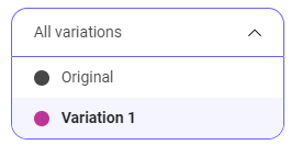
To choose the variations you want to display on the comparative view, open the second drop-down menu by clicking on it.
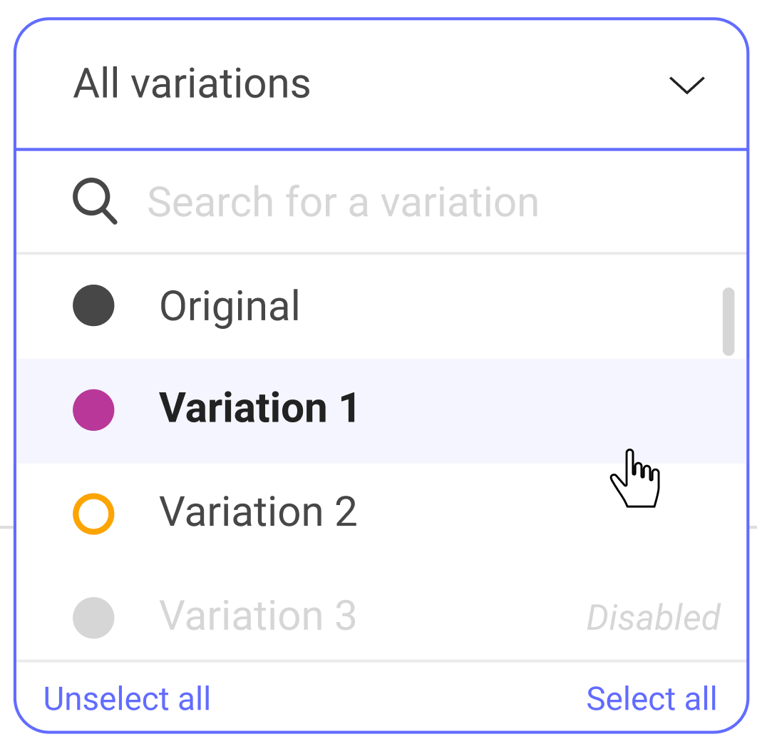
All variations are displayed in the drop-down menu. By default, all active variations are selected and appear in the comparative view. The deactivated variations are neither selected nor displayed.
To hide or show variations, deselect and select them by simply clicking on them.
Read the comparative view graph
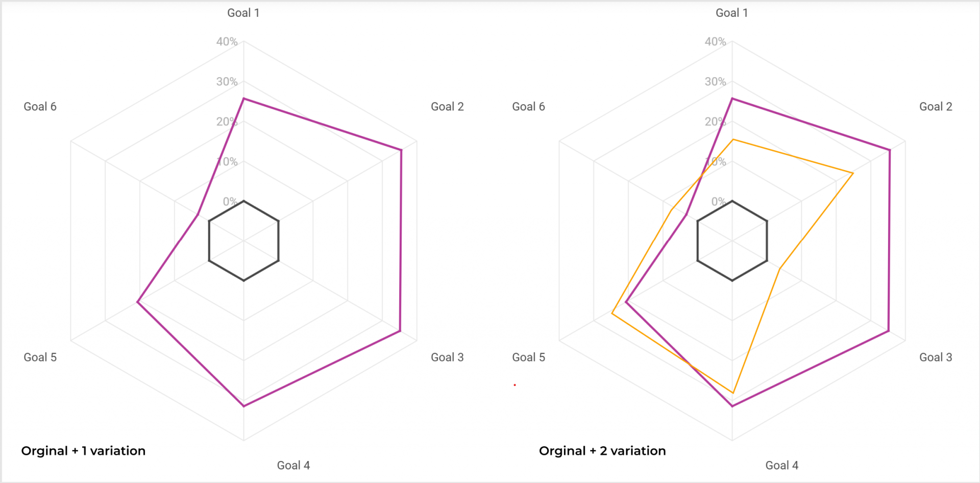
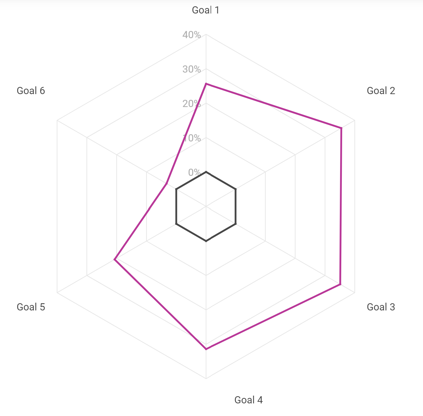
The comparative view displays, on a spider web graph, the rate of improvement of the variations on each goal. The original variation, shown in black, is the reference. You can quickly see which variations outperform or underperform on different goals.
We can see, on the example above, that the displayed variation (in blue) is more powerful than the original (in black) on the goals 1, 7 and 8 but underperforms on the other ones.
View improvement rates for a variation
On hover
To visualize the improvement rate of a variation on a goal, hover with the mouse the point of intersection between the axis of the goal and the curve of the variation.
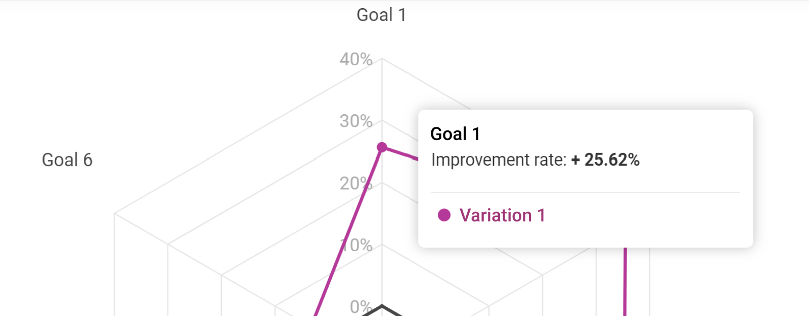
A dot appears to highlight the location when hovering with the mouse. A pop-in displays and indicates the improvement rate of the variation on hover, towards the goal on hover.
At the click
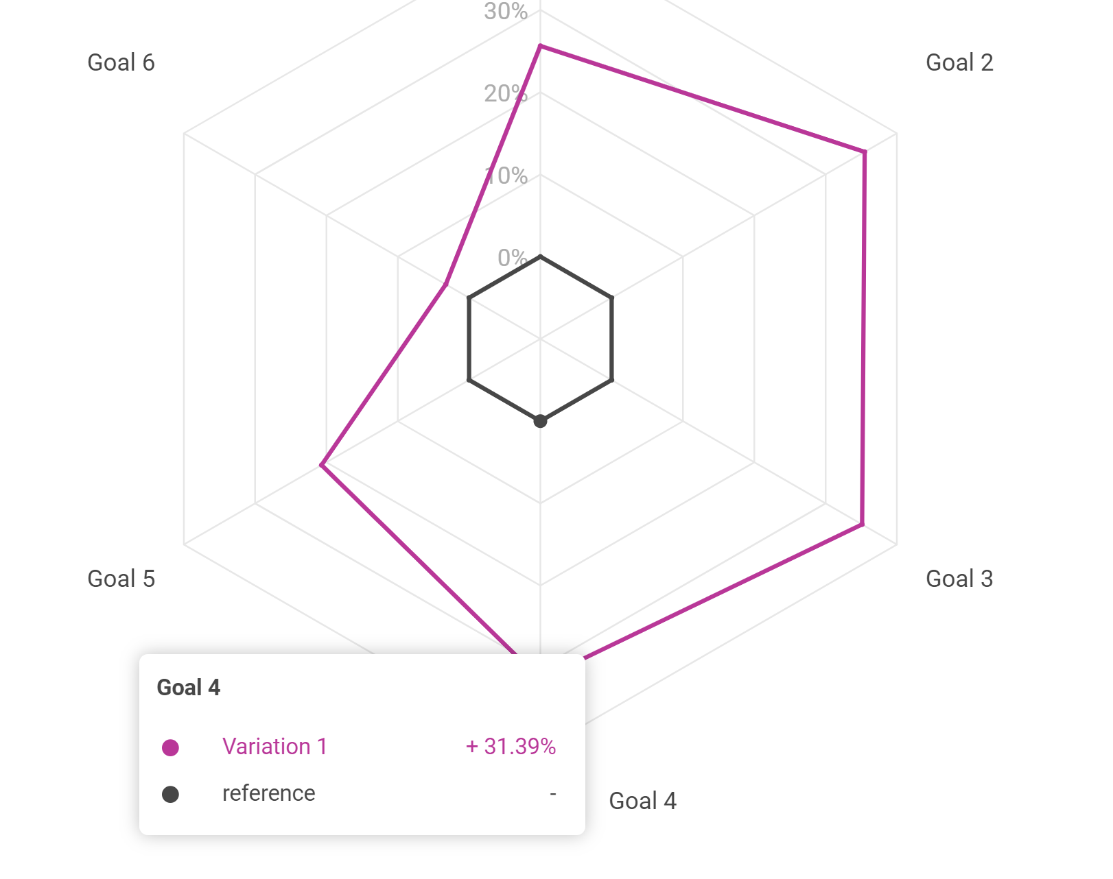
Click on one of the intersection points to highlight the intersection points of the variation on all goals and display the details.
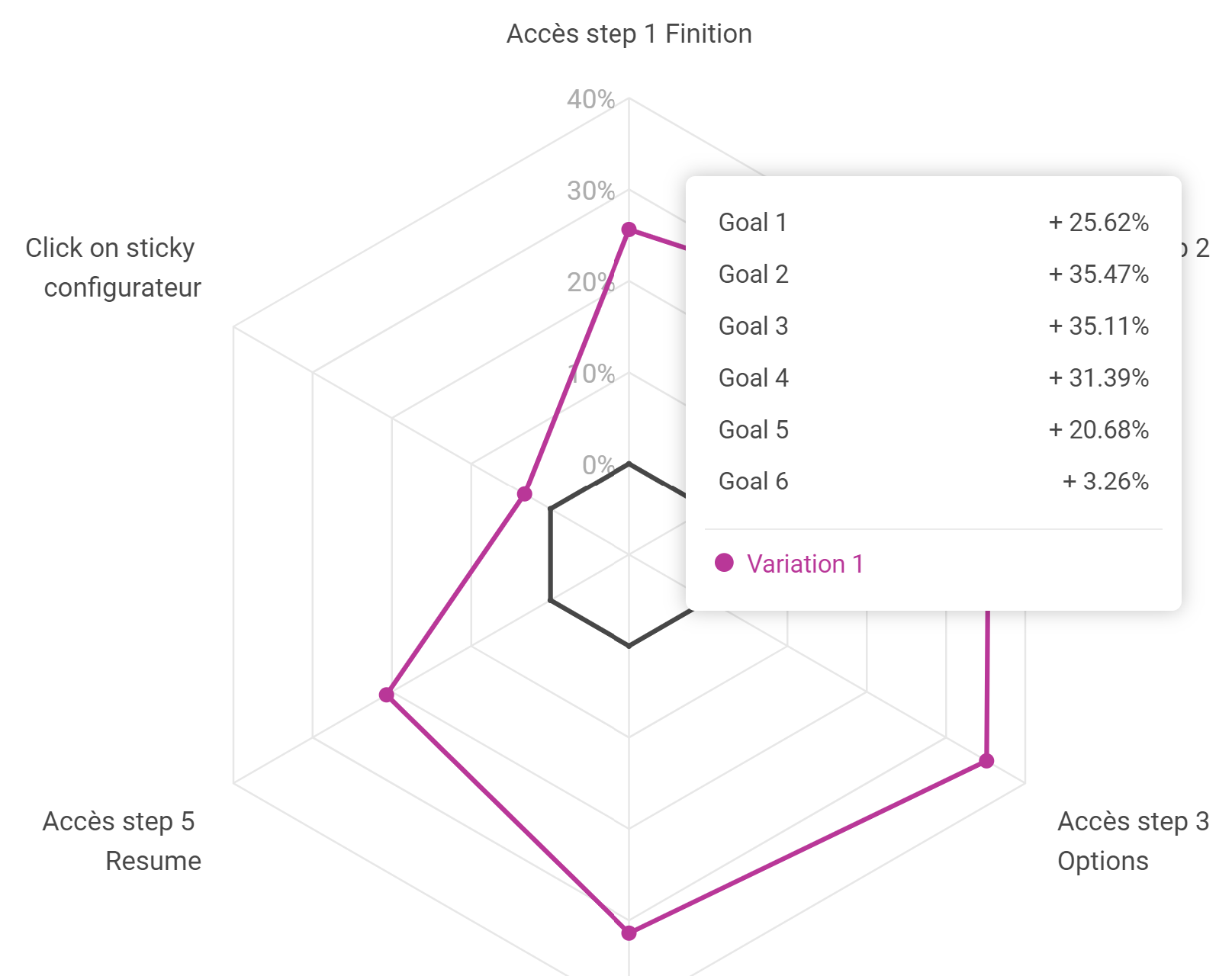
In the tooltip that appears, you find the improvement rate of the variation on each of the goals displayed in the graph.
Click outside the tooltip to close it.
View improvement rates on a goal
To see the improvement rates of the variations displayed in the graph for a particular goal, hover over the goal name with your mouse.